Watch Dogs seems destined to become one of those BIG RELEASE videogames that come around only a few times each year. It seems a lock to be one of those games that people line up overnight for so as to not miss out on a single second of the morning-after cultural conversation, a game that receives a bloated Metacritic rating because it’s already been crowned as a BIG RELEASE. And there’s a chance that Watch Dogs will earn all the premature accolades it’s being awarded. An open world, spying, lurking in the shadows, an intensely techno-positive outlook: these are the ingredients that, if combined properly and with even the slightest sense of innovation or passion, have historically led to financial success. It’s a shame then that what’s bound to be one of 2014’s biggest releases has such inadequate box art.
 The box art for Watch Dogs is of a piece with so many other generic titles and perpetuates a longstanding trend of box art being simply an afterthought in the overall process of creating and marketing a videogame. Admittedly, the box art for any given game is secondary to the game itself and the merits it contains. But accepting such mediocrity shouldn’t necessarily be standard practice; in fact, the Box Art Review column exists because videogames can and should be examined through numerous lenses, not just the narrowly focused one that privileges the game’s mechanics. What the box art for any given title has the potential to do is give us an immediate understanding of what our prospective purchase has to offer in terms of vision, narrative, gameplay, etc. The best examples work the same way album covers or great movies posters do; they have a surface appeal but also suggest something deeper, some sort of subtext. It’s why the gray morality of the box art for Dark Souls II or the noir-indebted, backstabbing brilliance of Max Payne 2: The Fall of Max Payne work so well. Those images aren’t just empty pieces of art slapped on a cover haphazardly. They have substance and artistic merit. The box art for Watch Dogs is, in opposition, unimaginative and aesthetically stale.
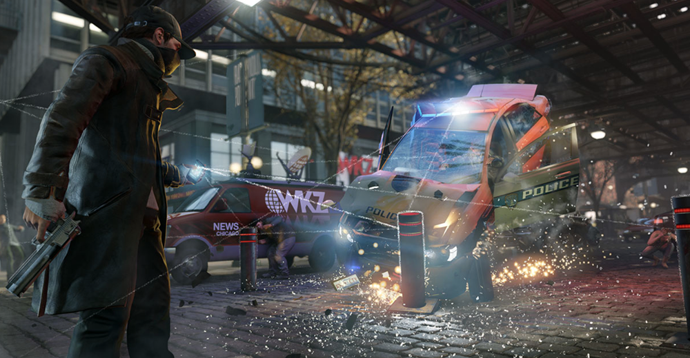
The box art here draws our attention to the open-world connectivity of the game, but the style and execution is rudimentary. Lines are drawn from the protagonists phone to various things surrounding him, confirming the game’s central conceit: through that phone, you can control and interact with your environment. The message is explicit and deeply uninteresting. And like the swaggering soldiers that adorn the covers of just about every single shooter on the market, so does Watch Dogs reproduce the bland, overbearing presence of its male hero (or antihero? Does it matter?). He hulks across the frame, a staggering presence against the hazy backdrop of the city. He’s clearly in control; he’s an alpha male, a take-no-prisoners hacker and sure-footed sleuth all in one. The entire image, like the character it makes its centerpiece, is a mess of cliché, muddled images, seemingly content to tick off every box on the “generic bad ass” box art checklist. The box art for Watch Dogs makes that one mistake that plagues so many standard covers: by adopting the signifiers of so many other games it forgets to craft its own identity.