Heterotopias is a series of visual investigations into virtual spaces performed by artist and writer Gareth Damian Martin.
///
Videogames have always had something of a preference for islands. These closed spaces, limited by a shoreline, are the perfect conceit for creating an enclosed simulation—an isolated section of “reality” split off from the world. Despite this, thematically, games rarely have anything to say about their own predisposition towards landscapes of isolation, separation, and abandonment.
For Dear Esther, these are central themes. It’s easy to imagine that Dan Pinchbeck’s choice of an island setting for the original 2008 Half-Life 2 mod, built as part of a project at the University of Plymouth, was motivated by technical and practical reasons. But the island of Dear Esther seems to have quickly become a symbol for the game itself. Perhaps it’s unsurprising that an academic project would be so self-aware, but it is the delicacy of this self awareness that stands out.
When level artist Rob Briscoe took on a graphical conversion of Dear Esther in 2009, he brought a further layer of delicacy to its world. The resulting 2012 version demonstrated a mastery of light and form, its journey through a series of rhythmical spaces scored by the careful direction of Jessica Curry’s music and the reassuring warmth of Nigel Carrington’s voice. It became a cultural island all of its own, a small but beautifully formed experiment that carefully laid out a piece of previously unexplored territory from pieces borrowed from the storied past of first-person games, and stripped everything but tone, emotion, and form.
This year’s Dear Esther: Landmark Edition, surely the final form, is an equally restrained affair. Briscoe has returned to shift the 2012 version from the Source Engine to Unity, resisting the temptation to “visually upgrade” the game in any way. It’s a laudable approach, and one that it would be good to see repeated elsewhere. By doing this, Briscoe preserves Dear Esther‘s artistry rather than muddying it. The result is a wonderfully imperfect recreation of a vital cultural object.

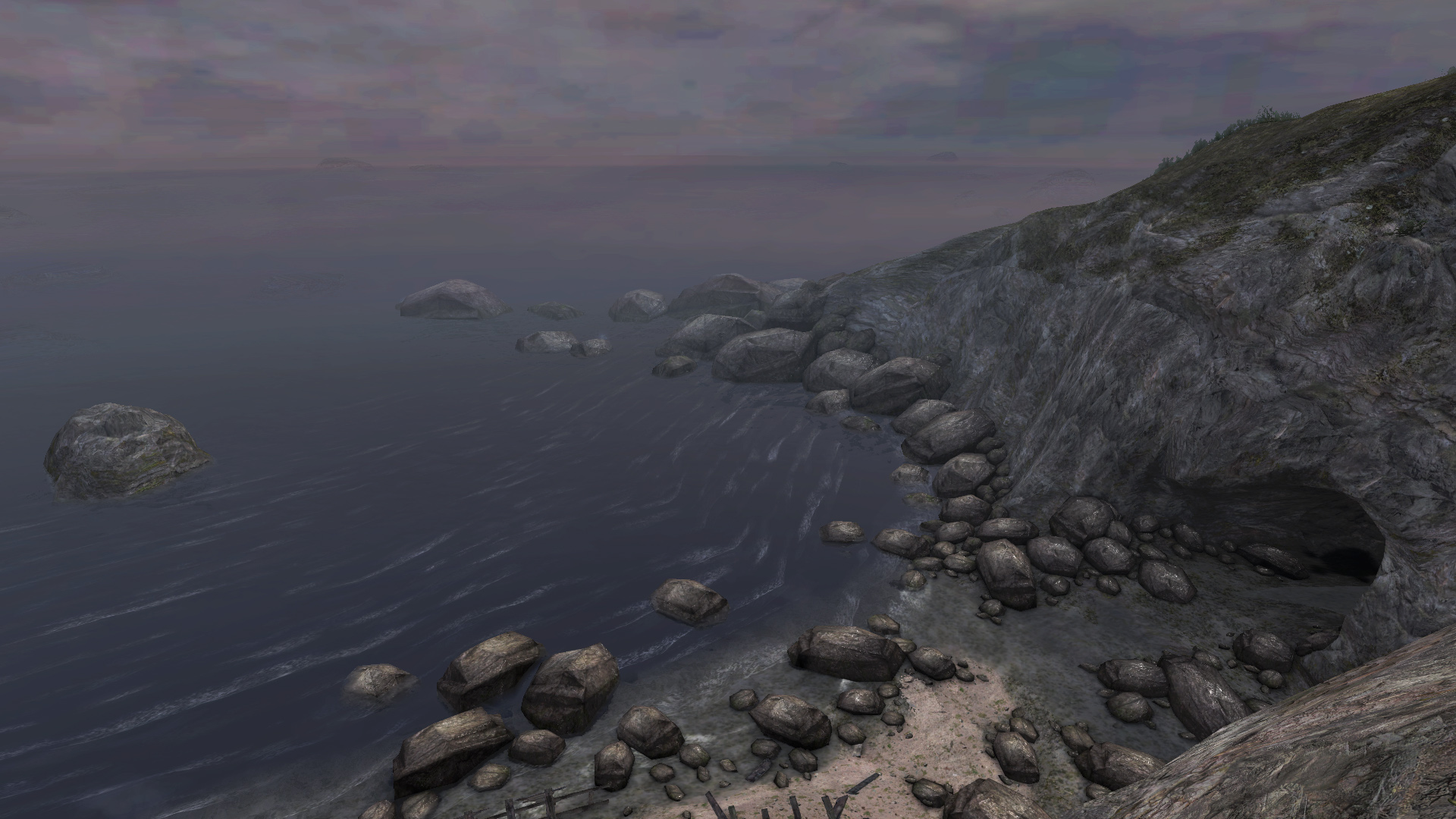
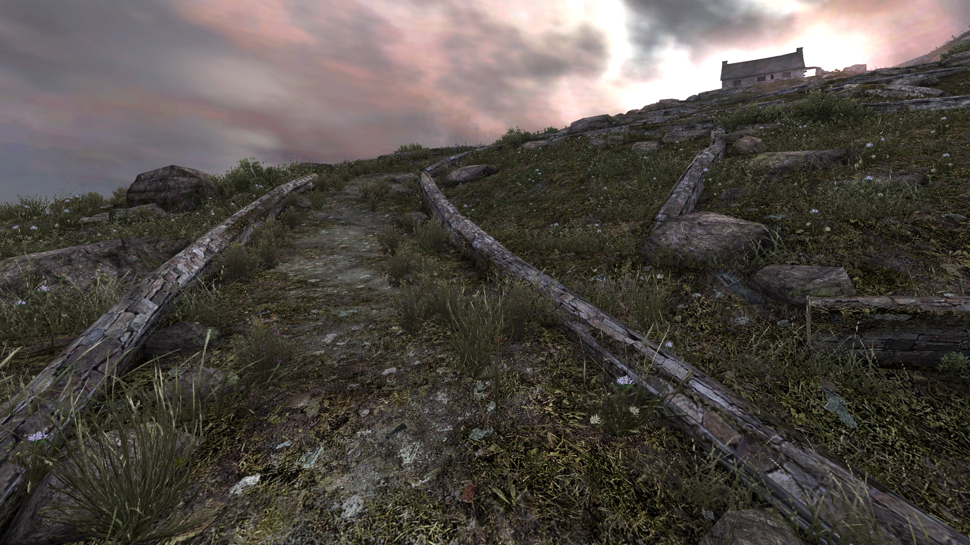

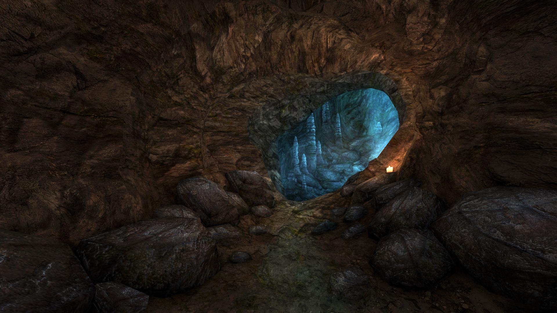


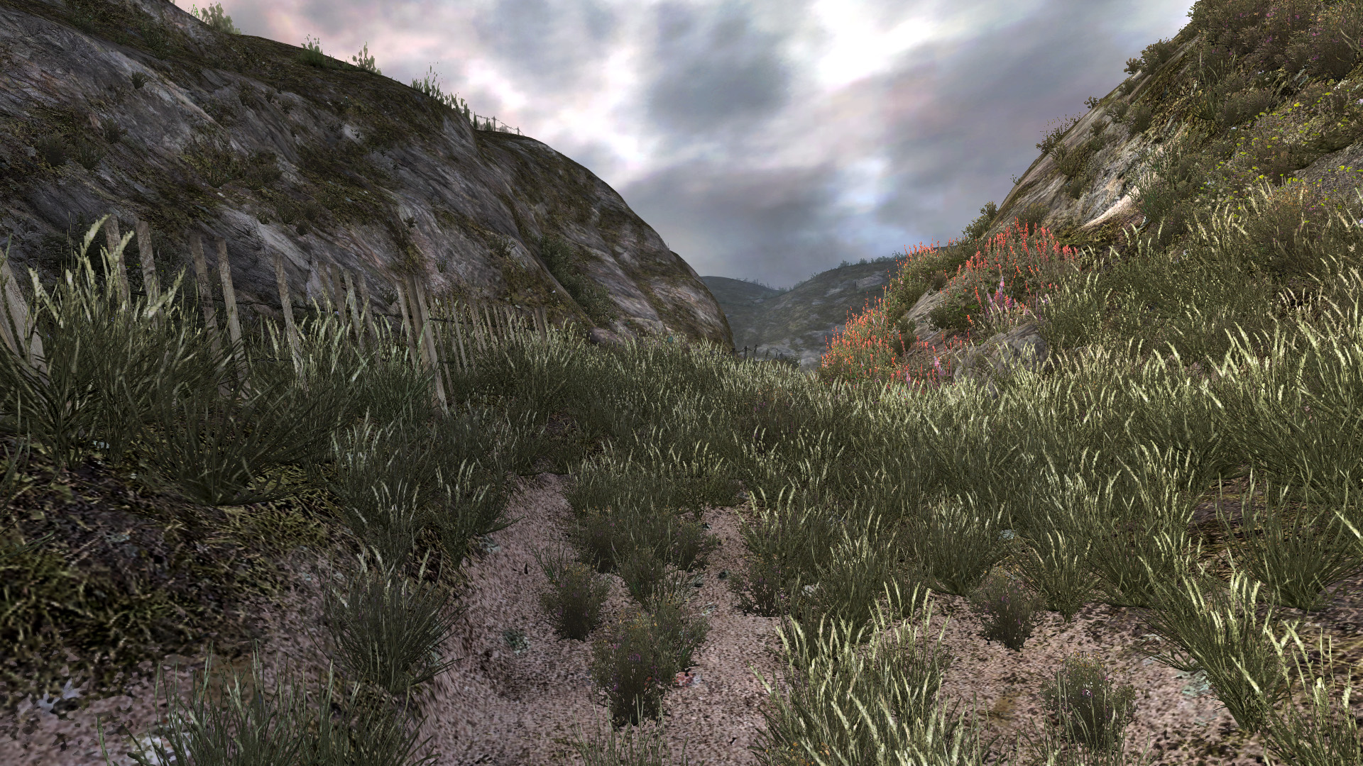
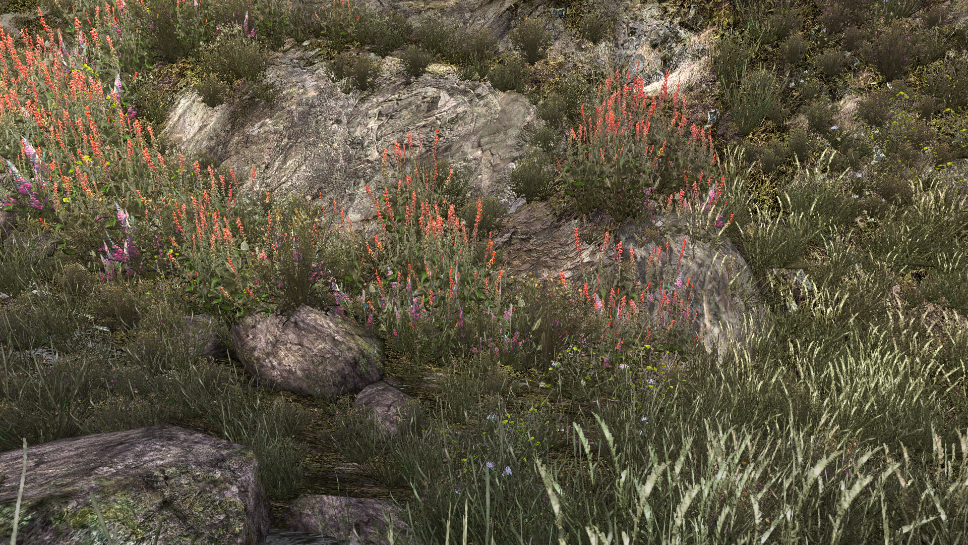
That sense of Dear Esther as a cultural object, not a world or “alternate reality,” stuck with me as I returned to it for this column. In particular I found myself recognizing the traces of Valve’s Source Engine that lay across its world. Briscoe admits that the game’s aesthetic and level structure was shaped by the engine’s limits and strengths, but even without his recognition of this, it is self evident in the game. The soft, flat light of the world, the tendency towards detailed, almost pointillist texturing, even the choice of props which was guided by Pinchbeck’s original selective use of existing Source assets. That’s the strange thing about Dear Esther; that in many ways it does not more than passingly resemble a Hebridean island. It’s something that perhaps can only be picked up if you have, like me, spent much of your childhood on the windswept islands of Scotland. It’s in the geology, the plants, the sand, in a thousand tiny details that feel disjointed from my memories and images of Eigg, Mull, Skye, and the scattered pieces of Orkney.
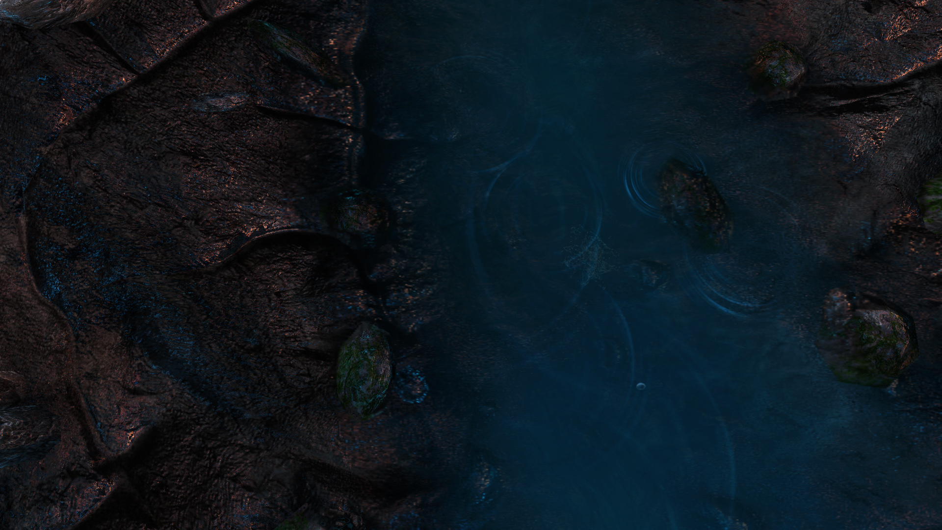
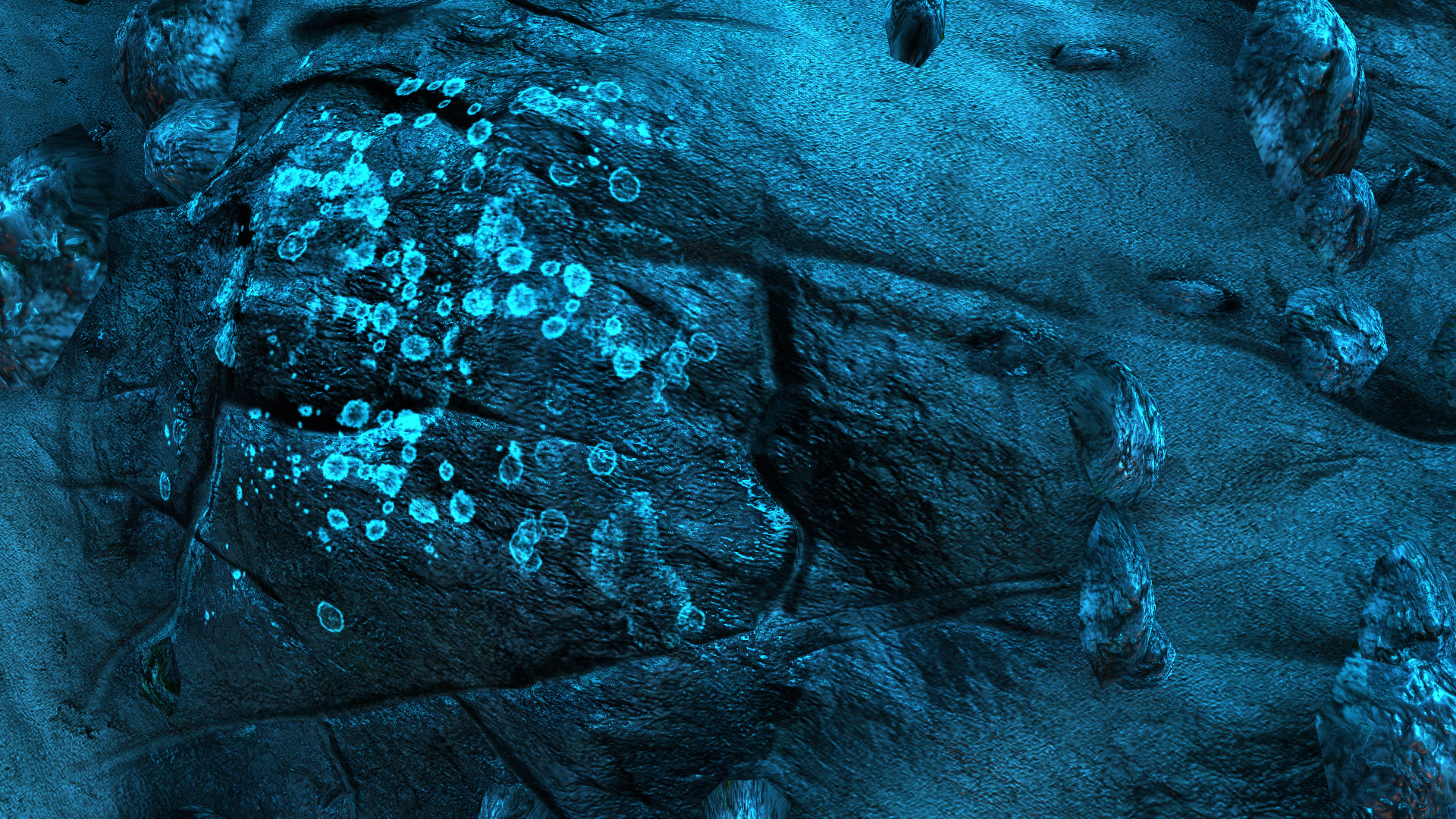
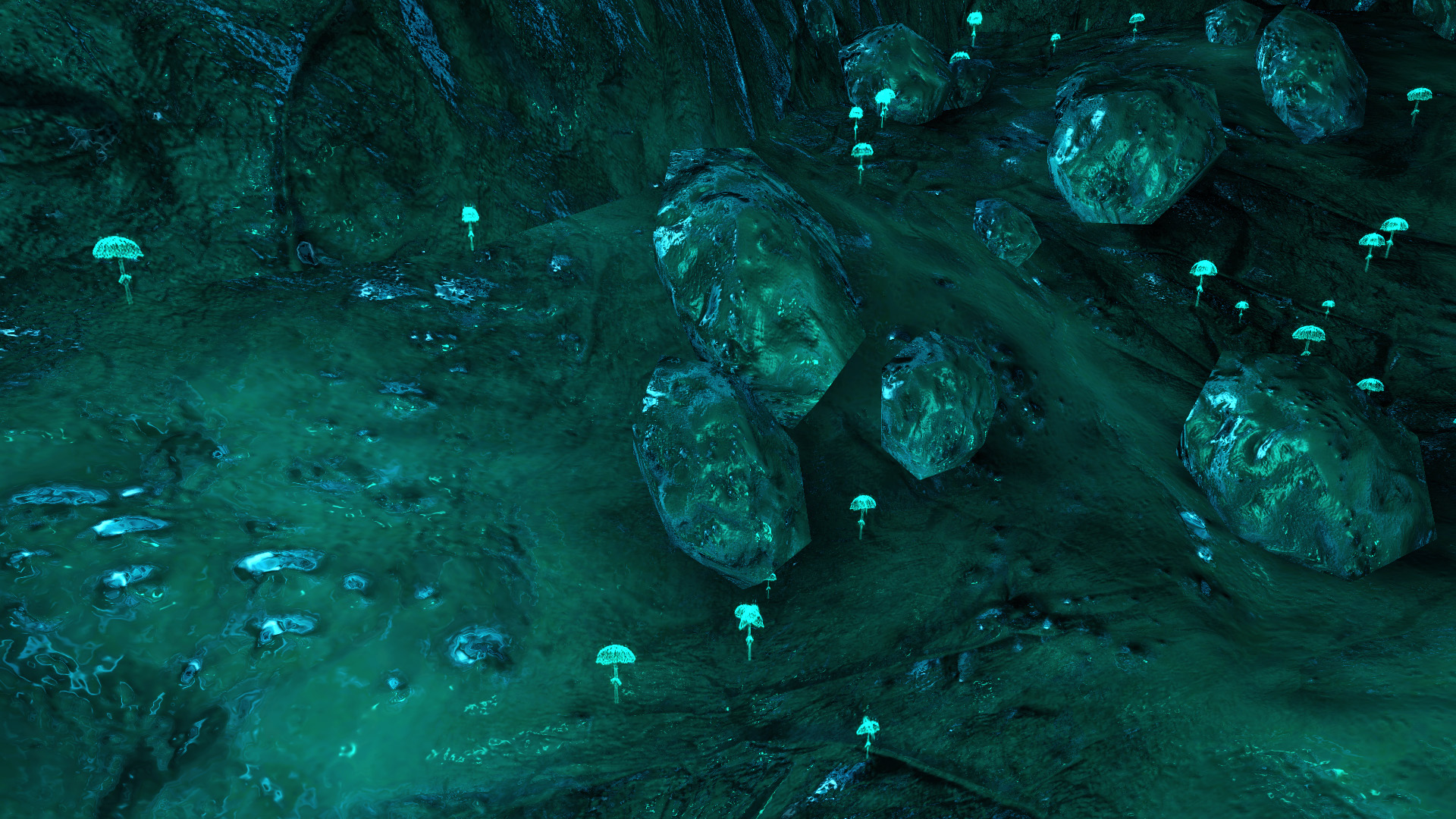
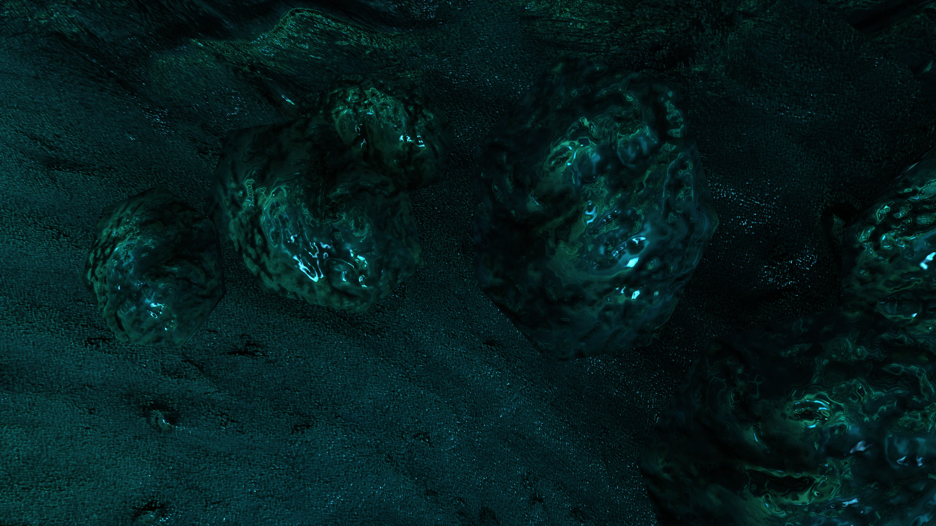
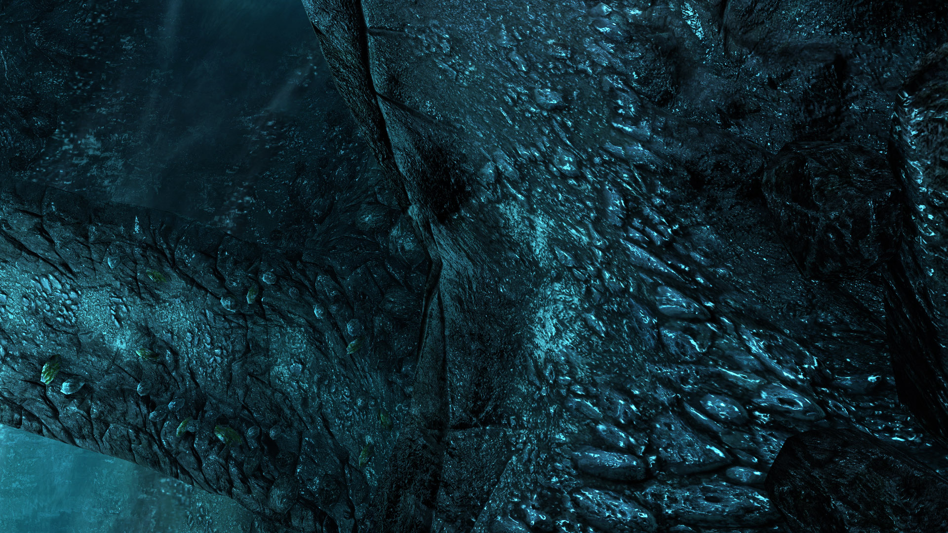
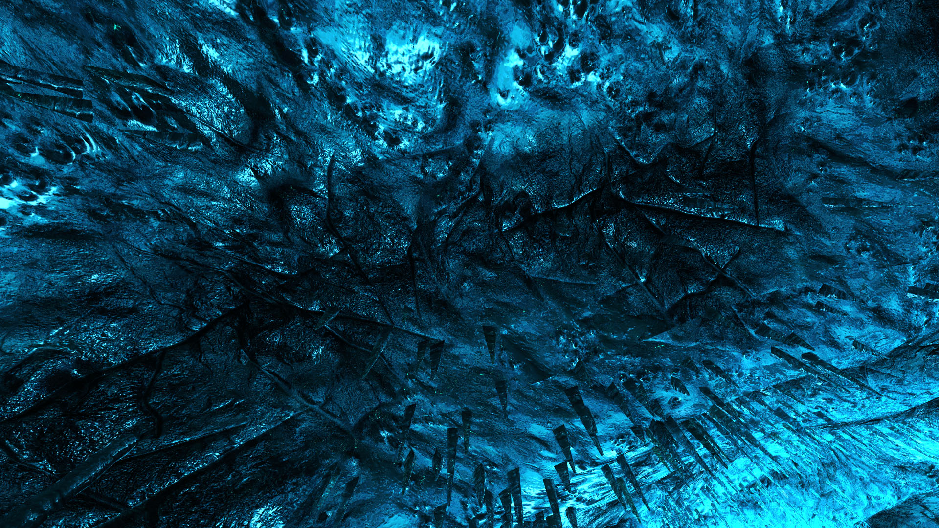
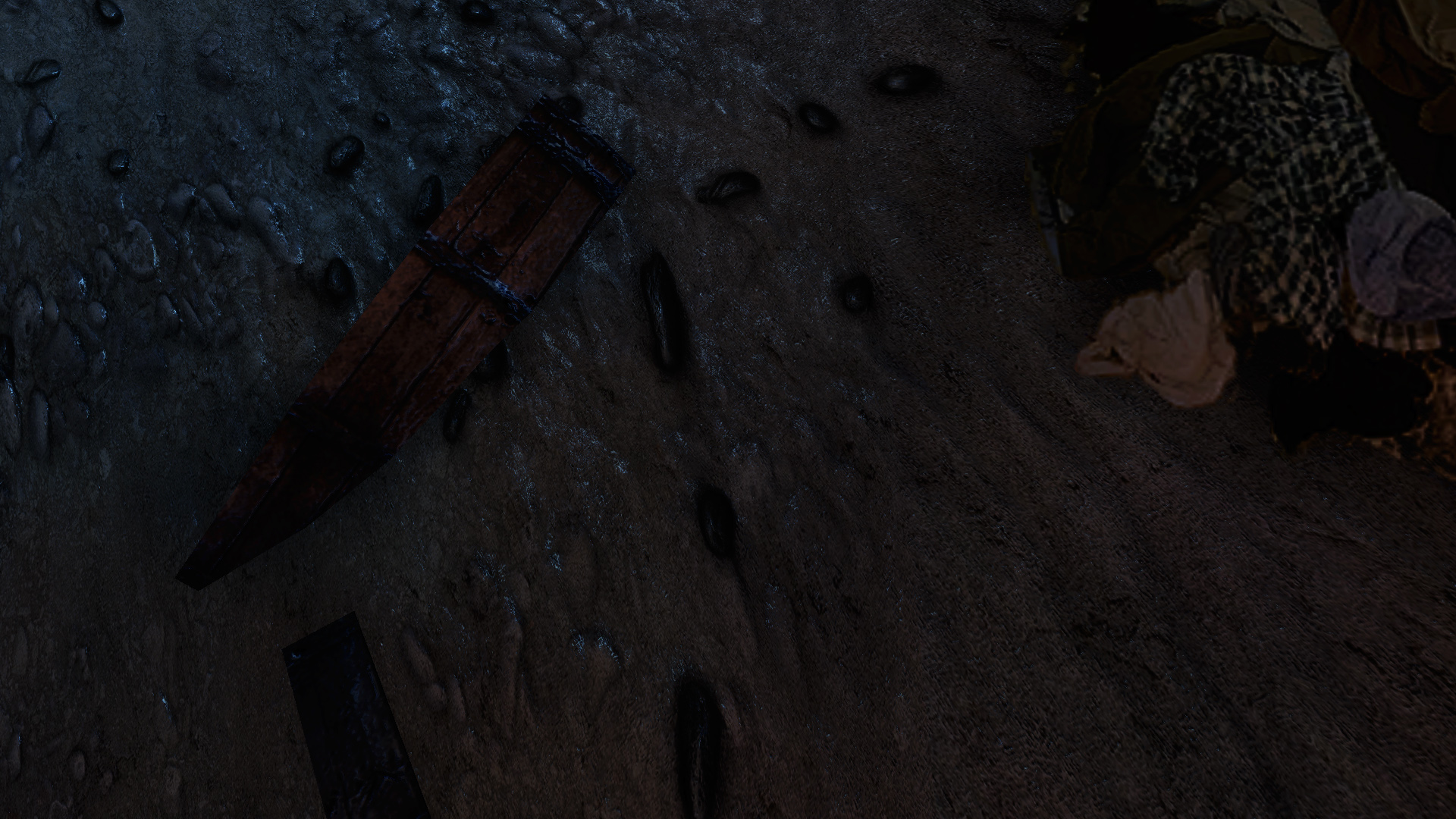
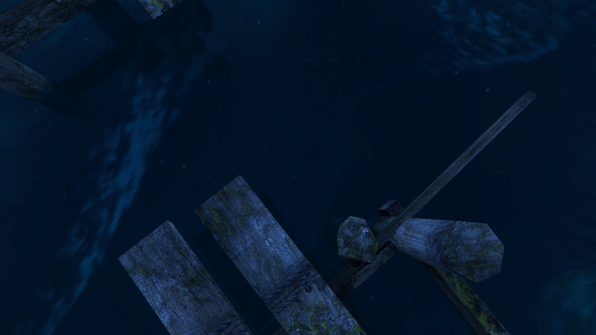
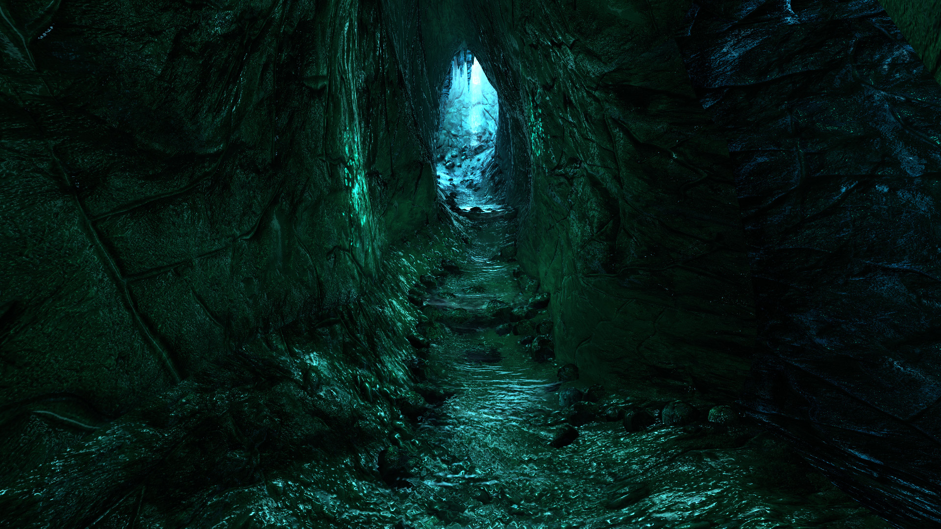
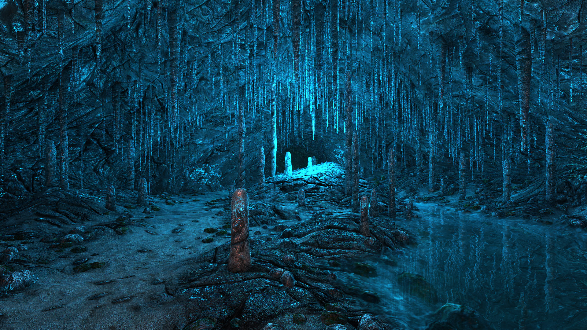
This is not a critique of the game’s accuracy, but more a recognition of how it is as much a representation of a game engine and its aesthetics as it is an analog of a real location in the world. For this reason, over this new playthrough, I found myself increasingly disinterested in capturing the beautifully arranged landscapes the game reveals to you, and instead fascinated by the digital material of this object world. I was drawn to limited details, distorted textures, to the pointillist approach to color that leads to the somehow both saturated and drained look of the game. This feeling of awareness became entwined with the game’s own fictional self-awareness; the overt suggestion that the island is a figment of the character’s imagination, a psychological purgatory they must endure.
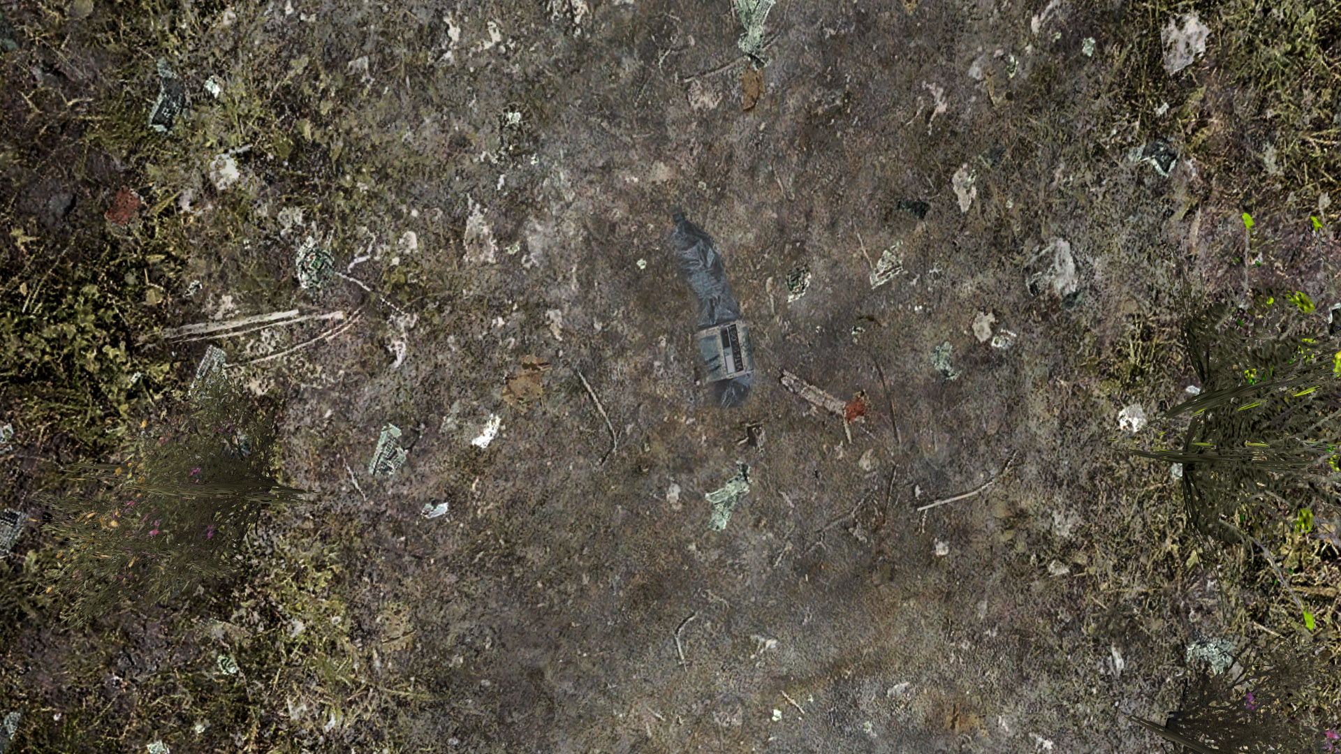
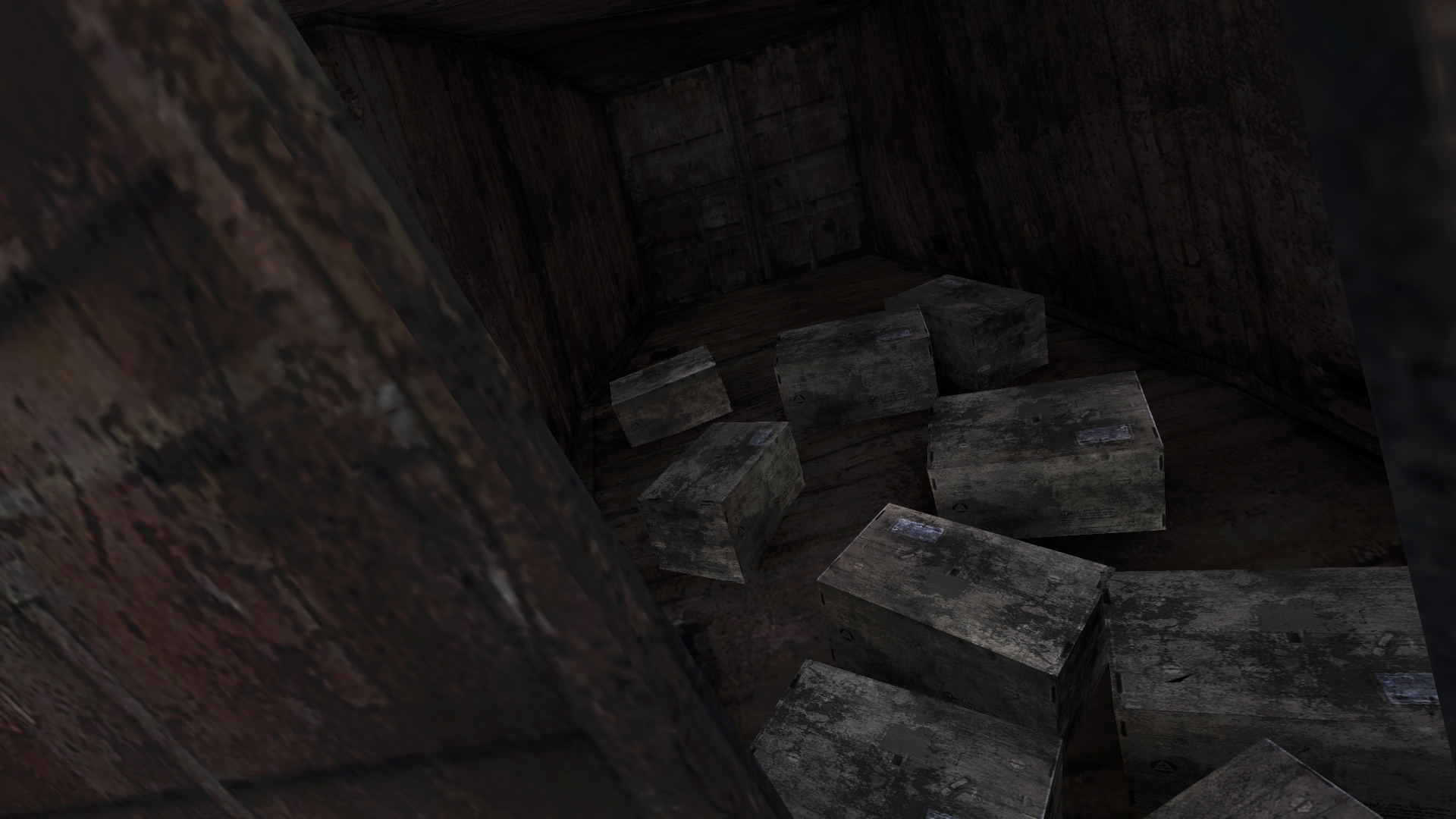
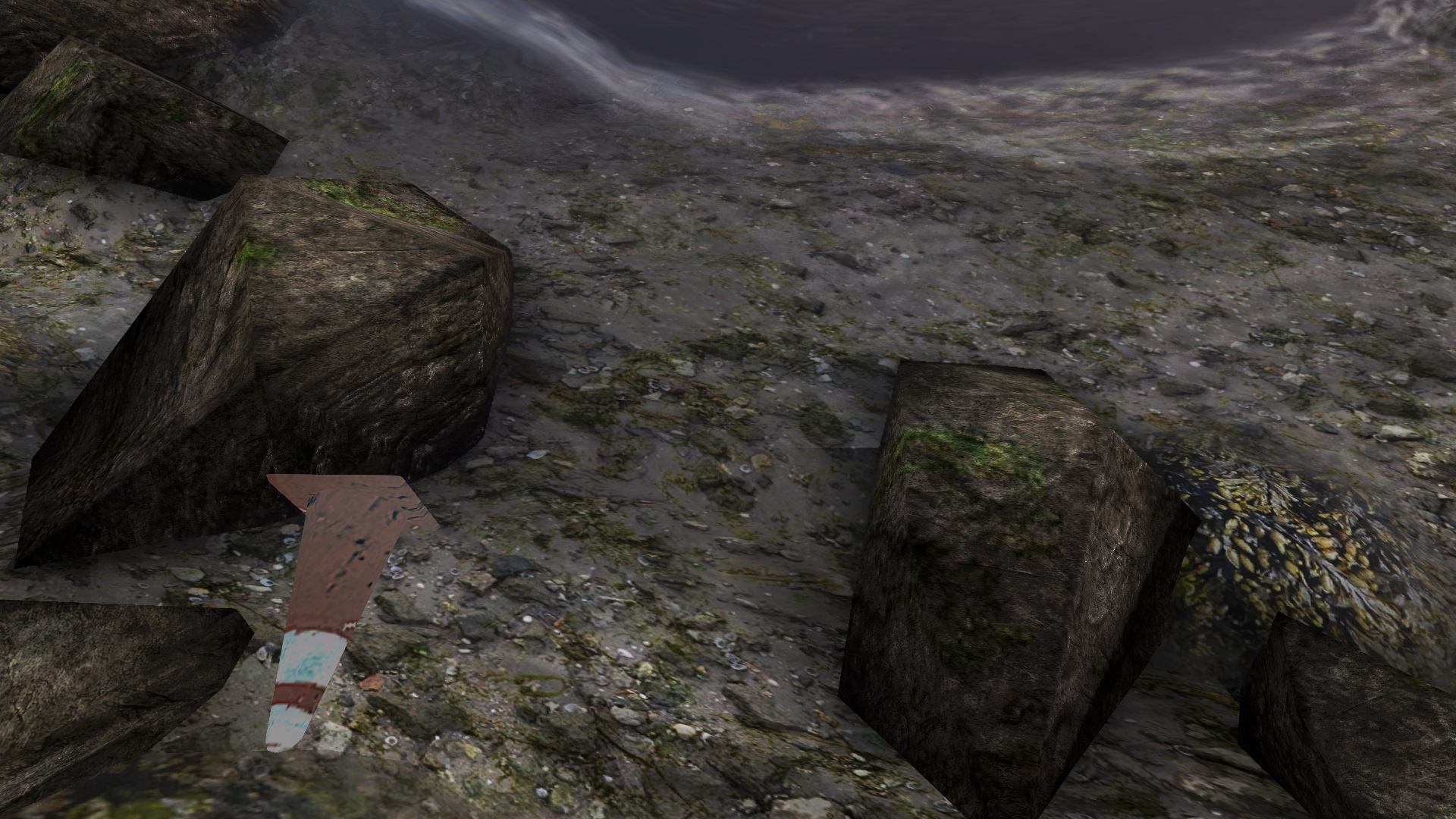
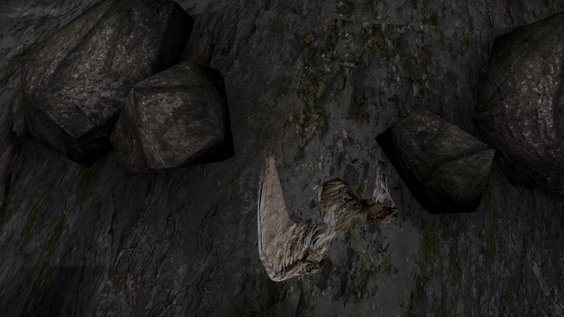
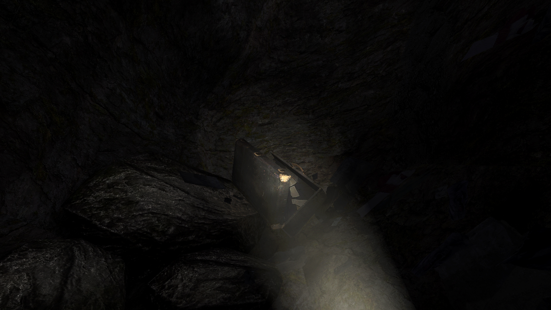
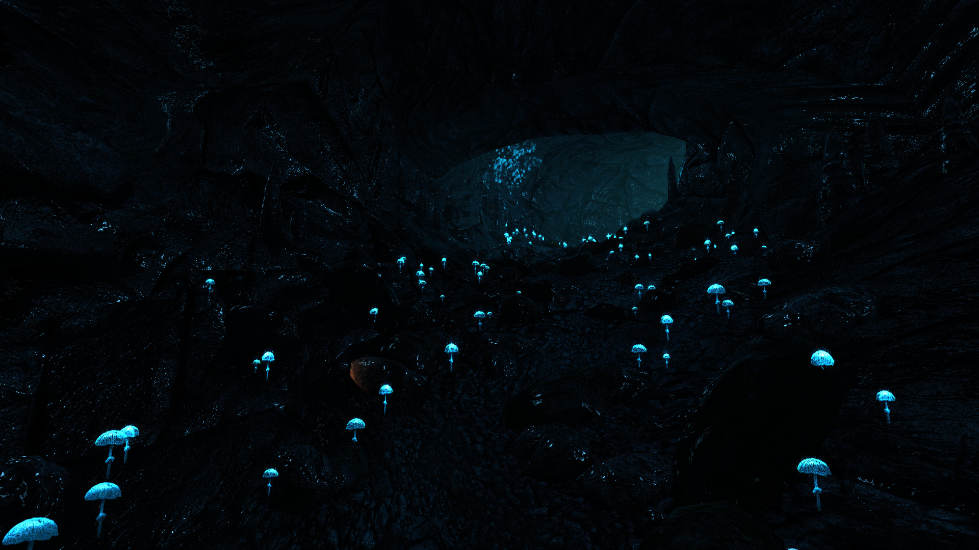
I started to think of the textures, the distortions, the limits of the engine as analogous to the character’s limited imagination. As if this dead, digital island was an object brought to life by a mind in mourning. I found significance in the pixelated corpse of a seabird, in the trash jammed into a sand texture, in the constant reminders of the limits of this island. Might the game’s secrets be hidden in the way one polygonal plane joins another? In the flat detailing on a supposedly natural surface, that reveals itself to be entirely digital?
That might sound absurd, and yet I suspect there is more truth to it than we imagine. Games are objects, and their material makeup matters. By preserving, not transforming Dear Esther, this edition brings that into focus.
What follows then is a record of the pieces that make up the whole. The persevered, embalmed details of this exquisite corpse.