This is the final of a three-part series. You can read part one here and part two here.
6. Geometric Shadows
We’ve seen plenty of low-poly designers and artists who leverage Modernist ideas to inspire primarily positive vibes, but others in low-poly’s second wave are using the style’s evocative potential to lead players into less comforting territory. And just as the lighter feelings inspired by the games mentioned earlier ranged from the meditative to the purely pleasurable, their darker counterparts seek to elicit everything from creeping unease to outright aggression—a spectrum mirrored by certain Modern artists.
More twilight than witching hour, India-based independent studio Oleomingus seeks to use low-poly in part to continually unbalance players in their forthcoming title Somewhere. The game is a kind of narrative nesting doll heavily influenced by magical realist literature. Players must unravel the tale layer by layer in pursuit of a mythical city called Kayamgadh—which may or may not actually exist.
Playing through the game means playing through a series of stories within stories. Nearly every aspect of the experience, from the player’s identity to her setting to her understanding of the world enveloping her, remains in perpetual motion. Other characters can be snuck up on, possessed, and later revealed as nothing more than figments of another character’s imagination. Photographs can be entered and explored like portals to new lands, bringing “reality” itself into question. Nothing can be taken for granted. Everything must be interrogated.
Dhruv Jani of Oleomingus explained to me via email that the game’s graphic style was designed to contribute to the sense of unease and mystery. The visuals keep a player perpetually off her axis by mixing obvious unreality with more faithfully naturalistic objects, leaving her unsure of what to make of this world: “Using low-polygon art specifically helps us exacerbate this feeling of an askance reality, because some portions of the environment are oddly realized (like the jagged boulders), and others which are geometric even in the real world look almost normal.”
The aesthetic strategy neatly dovetails with a particular brand of dread: what is often referred to as the uncanny. Freud deconstructed the concept at length in a 1919 essay, arguing that “the ‘uncanny’ is that class of the terrifying which leads back to something long known to us, once very familiar,” and that “an uncanny effect is often and easily produced by effacing the distinction between imagination and reality.”
Somewhere’s low-poly world uses both qualities to tweak player’s nerves. By blending the familiar and the unfamiliar, the real and the surreal, the naturalistic and the stylized, the game’s graphics team with the story to usher the player into a quietly but consistently tense emotional experience.
Designer Jochen Mistiaen seeks to ratchet the disquiet even higher in Malebolgia, his upcoming low-poly dungeon crawler inspired by the lowest level of Hell in Dante Alighieri’s Inferno. The harrowing atmospheric journey comes to life onscreen through a specific technique within the larger low-poly aesthetic: cel-shading, which abandons “realistic” gradient shadows in favor of a color-blocked alternative.
It’s a style intentionally engineered to echo the look of hand-drawn cartoons or comics—both of which look “obviously fake” in a way that broadly parallels the polygon-ness of low-poly. In the process, the two become natural complements.

Not coincidentally, cel-shading defined some of the earlier generation low-poly games most influential to today’s re-interpreters. Mistiaen cites Killer7 and The Legend of Zelda: The Wind Waker as touchstones for Malebolgia’s look. (Wind Waker, in fact, manifested in some way in nearly every conversation I had with designers for this piece.) With the benefit of hindsight, it’s now clear that, by embracing their essence, these games actually aged more gracefully than contemporaries who Botoxed themselves into oblivion in pursuit of fidelity.
Mistiaen nodded to both the practicality of cel-shaded low-poly and the payoff in mood when I asked him about his motivations for adopting it. “Cel-shading consequently offers a good way to have an original look (especially for horror games), avoid the necessity of textures and normal maps, and can look good even with low-poly or blocky models,” he wrote. “You can work more with the general shapes, silhouettes and colors, instead of close details… [and this] allows me use darkness to create atmosphere while hiding (lack of) detail”
The concept of tailoring 3D artwork to suit a disturbing mood is foundational to Leo Burke, too. And perhaps no other designer is using it in a more avant-garde way. In talking about the origin of his existential adventure game Scarred, he told me, “I didn’t want to make a game about technical quality. I wanted to make a game about my expression. I wanted to put as much emotional feel into the game as possible.”
The result is both troubling and cathartic—a game in which the quest is open to interpretation and the only damage threatening to derail the journey is psychological, not physical. Picture Tomb Raider reimagined by Holden Caulfield.
Burke’s experience with Scarred and its largely favorable reception helped convince him to continue his mood-driven development process. “Typically, when starting a project there’s an emotion I want to get across. So I start designing the game with that emotion in mind.” That statement loudly echoes similar ones made by the Modern artists, particularly Paul Cézanne, who once proclaimed, “A work of art which did not begin in emotion is not art.”
Burke’s latest release is a short yet even more anxious evolution of these ideas. His low-poly trilogy 776/778/780 is intentionally split into three separate executable files as part of a larger effort to make the experience feel “combative” to the player, as if she is dueling with the A.I. simply for the opportunity to play the game at all.
It’s a losing battle, too. Both of the game’s latter episodes abruptly “push you out,” in Burke’s words, before you’re able to reach a traditional narrative resolution.
In Burke’s mind, 776/778/780 is a game “about feeling lost”—an experience of powerlessness rendered in low-poly. To me, it’s also a game about how things fall apart. While the story beats in all three episodes are essentially the same by design, opening each subsequent chapter introduces the player into a world degenerating step by jarring step.
And although everything from the increasingly bizarre behavior of the non-player characters to the mutating score reflects the game world’s steady decay, nowhere is the erosion more viscerally apparent than in the graphics.

In 776, the characters—all anthropomorphic foxes—are modeled simply but expressively. The colors basically hold true to the natural world: The landscape is a mix of greens, yellows, and browns; the foxes are copper; the night sky is a dull midnight. The lighting is organic and environmental, with subtle ambience emanating from the horizon line and pale lemon beams projecting from both the hoverbikes’ headlights and the various guideposts scattered throughout the terrain.
But entering 778 seems to usher the player into a systemic visual glitch, as if someone just doused her video card in shroom tea. The player’s fox is the only one unaffected. Its friends are still low-poly models, but each one has been stripped of their 776 clothes and digitally re-skinned in different hallucinatory textures and psychedelic hues.
The landscape, though still the same construct of jagged hills and tall grass, sears through the screen in shades of magenta and pink. Even more disturbing, its radioactive colors stand in as the only light source. The night sky has been deadened to a flat black.
The distortions amplify in 780. The player’s fox is reduced to a monochrome grey contoured in black outlines—highly reminiscent of the protagonist in Scarred—and its only remaining friend exists as a black wraith outlined in white. The same is true of their respective hoverbikes.

The landscape’s underlying topography remains consistent with the earlier episodes, but the tall grasses have seemingly been burned away by an infinitely repeating lava texture. Perversely, the sky above is a soft blue with idyllic clouds—in fact, Burke identifies it as the “default skybox” option in Unity, the game engine used to create the trilogy.
What makes playing through 776/778/780 so disturbing isn’t just the progressive corruption of a familiar environment, though that’s certainly a factor. It’s that Burke essentially invites players to watch him deconstruct low-poly art itself—and 3D graphics more generally—piece by piece. Other low-poly artists feature the aesthetic’s seams, but here Burke gleefully rips them apart in front of our eyes.
It’s a thoroughly Modernist move, both visually and emotionally. One can see a similar demolition of naturalism and sentimentality by chronologically viewing Picasso’s self-portraits. Like 776/778/780, they constitute an almost uninterrupted undressing of the image-making process. The experience is all the more affecting because the progression tracks not only an increasingly honest acknowledgment of painting as fiction but also the artist’s march from youth toward the inevitable end.
Other Modern artists worked toward even more extreme emotional goals. In the 1909 Futurist Manifesto, F.T. Marinetti captured his nascent artistic and political movement’s essence as a call to arms, writing, “Beauty exists only in struggle. There is no masterpiece that has not an aggressive character.” He announced that art “must be a violent assault on the forces of the unknown, to force them to bow before man,” and as a bullet aimed at the academies’ doomed commitment to fidelity, asked, “What can you find in an old picture except the painful contortions of the artist trying to break uncrossable barriers which obstruct the full expression of his dream?”
Though less militant than Marinetti, the Dutch painter and art critic Jacob Bendien was just as true to the deliberately restless spirit of Expressionism when he chose this analogy to describe the style: “If an Expressionist paints a sheep being mauled by a wolf, he does not paint a sheep or a wolf with paws and nails and long or short fur … he paints mauling and being mauled.”
In that sense, select Modern art retroactively reinforces what Burke and other members of low-poly’s new wave now understand: Sometimes the most effective way to unsettle an audience is to show, not hide, what the visuals are made of.
///
7. Adding Up to Eternity
Though Burke’s games cast none of the sunlight of some of his peers’ work, they serve as a helpful reminder of the crucial difference between the Modern artists’ use of “primitivism” and second wave low-poly’s use of nostalgia. No matter how much the past may be idealized in their artwork, the designers and artists re-interpreting the Unreal era today actually lived through those times, played the games they’re building off of, experienced the feelings they’re seeking to inspire again.
This fact leads to the banner theme that emerged from my interviews: the powerful link between second wave low-poly and personal meaning. Regardless of which emotions these designers and artists sought to infuse into their work, regardless of what challenges they faced in producing it, many forged ahead because their projects simply mattered too much for them to ignore.
Whether the end goal was a surge of joy, a therapeutic diversion, or a capsule of alienation, low-poly offered a way for creators to express themselves within whatever practical or conceptual straitjacket tried to hold them back.
In Kyoto Wild and Gravity Bone, Diefenbach and Chung wanted to re-ignite the pure pleasure of youth. In Skipping Stones and Biome, KO-OP Mode and Knick Knack created badly needed escape valves from the crises and complexities of modern life. In Scarred and 776/778/780, Burke found catharsis by translating his existential struggles into game experiences.
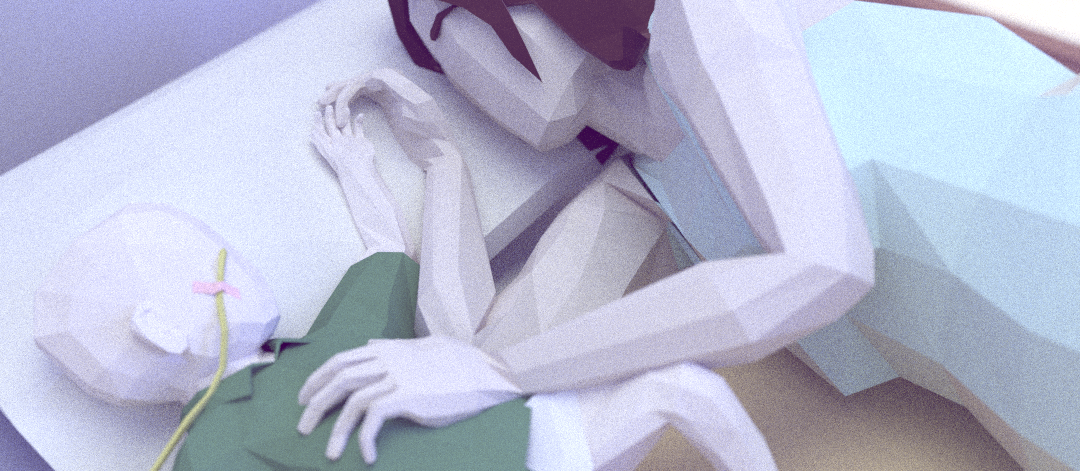
But no one I interviewed has used a contemporary low-poly aesthetic to embark on a quest as visceral, as intimate, and as meaningful as Ryan Green. His forthcoming project, That Dragon, Cancer, is officially described on the game’s website as “an interactive retelling” of Green and his family’s journey with their son Joel, who was diagnosed with a form of terminal cancer at age one yet lived past his fifth birthday before the disease took its ultimate toll.

When we talked over Skype, Green almost immediately defined That Dragon as a “game about communicating emotion, and so all of the choices are based on that.” And in understanding how he and his collaborators arrived at the project’s look, one sees nearly every Modernist reflection beamed out by my other interviewees, turning That Dragon into a kind of lens flare highlighting contemporary low-poly’s significance.
It seems semi-absurd to refer to the project as a “dramatization” of Joel’s life, as a child’s mortal illness is about as dramatic a storyline as reality can provide. But adapting such a harrowing and lengthy trial into game form presents many challenges, no matter how willing its architects may be to draw up unexpected or unorthodox plans.
Like many of the other designers and artists I spoke to, Green’s passion for his project was ankle-weighted by a relative lack of resources. That Dragon is now slated to debut on OUYA, a mid-level Android platform with a video card to match. But even before that opportunity manifested, Green wanted to design the game “to be able to play on a bunch of different platforms, to reach as many people as possible”—echoing the same desire for inclusiveness as Tom Kail did in regard to Biome.
But that accessibility would demand technological trade-offs, in the graphics and elsewhere. That was challenge number one.
Reminiscent of Diefenbach and Chung, Green also identified That Dragon as “the first time I’ve ever been able to throw myself totally into artwork” for a game—a positive spin on the fact that he had comparatively little in-depth experience on the medium’s visual side. Yet Green held onto the graphics responsibility. Joel’s story meant too much to him not to be intimately involved in determining That Dragon’s look.
Every aspect of the graphics had to radiate the right energy despite his inexpertise. Green realized that he would have to find a way to achieve “beauty on a budget,” in his words. That was challenge number two. And between his technological constraints and his skill deficit, it wouldn’t be easy.
One certainty, though, was that he needed to find a solution capable of communicating maximum emotional fidelity. And that at least provided a clear starting point in his mind. “It felt like [the game] needed to be 3D, but I didn’t have the skills to produce it,” Green told me. “I didn’t realize 3D is really five or six different disciplines to get something from modeling into the game engine.”
But as he and his growing team of collaborators debated the dimensionality issue, Green stood firm. “2D doesn’t feel immersive to me. It’s crucial that the player feels wrapped up in the atmosphere and can explore [the world]. It’s just easier to project yourself into a 3D game rather than a 2D one.”
Citing Timothy J. Reynolds’s work as a signal inspiration, Green and his team eventually decided that low-poly was a vessel capable of navigating the rapids in front of them—without jettisoning That Dragon’s emotional cargo. From there it became a matter of tailoring the aesthetic’s nuances to their specific needs.
Designer Josh Larson, the other half of the project’s central nervous system, mentioned that since their technology couldn’t support real-time lighting, they worked to transform that apparent weakness into a strength. “The lighting is actually higher fidelity than the objects. It helps draw the player into the environment, even though you can’t move lights around or change shadows [organically].” It’s a visual feature that parallels G.P. Lackey’s decision to bake Skipping Stones’ “lighting” into the flat textures of his polygons for a more distinctly Modern look.
Channeling more of That Dragon’s visual resources into lighting had a trickle-down effect on the rest of the graphics. The lighting not only became more atmospheric but sanded down the characteristically sharp edges of low-poly into something softer. While that made the objects on screen slightly more distinct within the second wave low-poly category, it did not make them any more classically naturalistic. The artwork stayed evocative rather than attempting description.
Not coincidentally, an identical preference carried over to the storytelling. Green and his team avoided a traditional documentary replay in favor of, at first, an entirely fantastical allegory: something like Joel’s life as Alice in Wonderland. But it didn’t last. Over time they realized that the metaphors were a blunt instrument—too obvious, too direct to support the nuances of emotion that they needed.
“The big improvement happened when we stopped trying to communicate the narrative of Joel and started trying to communicate the emotion of Joel—forgetting about the archetypes and going for true personal experience,” Green explained.

That Dragon thus evolved into, as Green describes it without knowledge of the comparison, a kind of magical realism similar to Somewhere’s. However, the specific tension in the narrative is different. In an attempt to access where “the eternal meets the temporal,” in Green’s words, the game now oscillates between scenes centered on Joel’s hospital stays and scenes in the wider world.
But in tune with the low-poly aesthetic, obviously unreal elements seep into both environments for evocative purposes. “Since we’re focusing on emotion,” Green explained, “we wanted to manifest visually what I felt like internally.”
That goal involved using the more expressive graphics to render more expressive images. For example, dehydration was a frequent threat as Joel battled certain aspects of his condition. So Green recounted a debate he had with Larson: “What does dehydration look like? How is the environment like Joel’s body?” Hence, at a certain point in the game Joel’s hospital room is invaded by a thick layer of dust—a visual that evokes his symptom more viscerally than any literal translation.
Low-poly was also crucial because it acted as a collaborative player in the broader context of the game’s features. Music, voice acting, sound design, and animation all became major focuses as That Dragon evolved. And the stylized minimalism of the graphics left space for all of the elements to work together. “We got very into body language and sound,” Green said, “because body language and sound was a lot of how Joel communicated. Visual fidelity isn’t that important because the [rest] counterbalances it.”
Larson backed up that idea. “Richness is greater than fidelity. You don’t have to depict everything if you can create a gesture or an impression of it. You can have primitive objects, but if they’re the right objects in the right places, that makes a bigger impact than realism.” Green chimed in with an example: “If you get a great voice actor, but you build [him] a character with dead eyes, you wasted everyone’s time.”
But there was one final advantage that made low-poly an ideal solution: the aesthetic strengthened the personal relatability of the game. “Low-poly felt bespoke, hand-crafted,” Green said. “We wanted that feeling that a human being made this.”
But crucially, not just any human being. That Dragon is arguably the best example of contemporary low-poly as “an expression of an individual vision,” to reprise Hirshhorn curator Melissa Ho’s description of Modern art. The game exists solely to transfer Green’s and his family’s singular emotional experience to players, and it does so in part by utilizing the aesthetic’s alleged shortcomings as opportunities.
In the process, the project transforms into a kind of interactive, living memory—an artwork capable of communicating a deeper truth than any technologically advanced, academically faithful representation. The Modernist perspective of Paul Cézanne seems especially apt:
Everything we look at disperses and vanishes, doesn’t it? Nature is always the same, and yet its appearance is always changing. It is our business as artists to convey the thrill of nature’s permanence along with the… appearance of all its changes. Painting must give us the flavor of nature’s eternity.
As Green and his collaborators exemplify, just like the late 19th and early 20th century Modern artists, today’s low-poly practitioners are utilizing color, line, and geometry to engineer that same flavor of eternity in the face of a constantly shifting technological landscape.
Their embrace of the polygon mirrors their long ago predecessors’ embrace of painting as painting—a willing fiction constructed from pigment, medium, and brushwork, yet nevertheless capable of evoking something human and timeless. With this attitude, they are helping to expand the expressive possibilities of games in ways as diverse and as innovative for the medium as those enabled by the Impressionists, the Expressionists, and the many other avant-garde contributors we now call Modernists.
Late in life, Picasso declared, “Computers are useless. They can only give you answers.” If he were alive today, he might be astonished at how closely those answers now resemble his own—and how well they’re likely to hold up by rejecting the same realistic tradition he and his like-minded contemporaries did so many years ago.
The core difference is that the rest of us get to experience these results in real time. Long live the new avant-garde.