Norwegian banknotes will soon be low-poly
In a functioning economy, money serves three purposes: It is easily exchangeable, the standard against which the value of items can be compared, and a way to store one’s wealth. Bills and coins that satisfy these requirements don’t have to look alike, but usually do. Their designs tend to highlight detailed portraits of historical figures, scenes, or objects. Despite being an abstraction of wealth, money is designed for literalists.
In 2017, the Norwegian Krone will break with tradition.
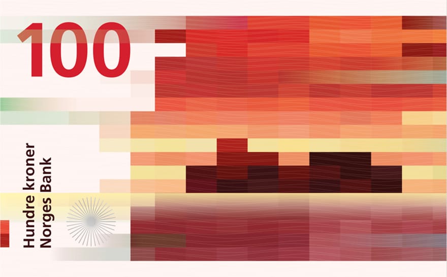
Earlier this year, Norges Bank called on eight design firms to propose new banknotes inspired by the sea. The competition’s two winning entries, submitted by The Metric System and Snøhetta, could not be more dissimilar. The Metric System’s design for the Krone’s front focuses on traditional drawings of maritime life. Snøhetta’s submission, which forms the back of the Krone, turns coastal scenes into pixelated abstractions.
Snøhetta’s design is a low-poly seascape. Buildings, land, the sea, and the sky are all rendered as collections of rectangles. There are no smooth edges or seamless gradients, just pixels. Familiar forms can be found in these designs but there are no explicit points of reference. In a press release, Snøhetta said, “Our goal is to bring people into creating their own interpretations and associations.”

These rectilinear patterns denote wind speeds as well as denominations. The 50NOK note illustrates a mild breeze with clear, cubic shapes, whereas the 1000NOK note uses elongated forms to represent gale-force winds; at that velocity, everything is a blur. In that respect, Snøhetta’s design is really an infographic masquerading as a seascape.
Virtual banknotes are increasingly common. They can be found in videogames ranging from Asheron’s Call to Zork. Cryptocurrencies like Bitcoin represent an even greater level of abstraction. Snohetta’s Krone design is the flipside to this trend. It infuses the aesthetics of low-poly games and information design into a paper note. As the designers put it: “Our cubical pattern first of all represents pixels; our time’s visual language.”