The unfriendly interfaces of subway systems
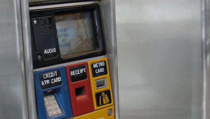
Different machines use different interfaces to encourage different practices from their users—Apple’s high degree of control over their operating system means everything looks visually cohesive, but with things like Gatekeeper, it also encourages users to buy from their App Store. Some of the more immoral free-to-play games designed for children feature frequent microtransactions, encouraging them to spend their parents’ money. If you ride a subway with any frequency, there’s a good chance you have a complaint or two with the system on the kiosks where you buy your tickets. Whether the touch screen has buttons that don’t activate until you break a finger on them, or it’s too slow and denies your payment every other time, it doesn’t seem like the machines are designed with you in mind. They are though—they’re designed to get you to keep using the subway or lose your money on an unused card.
New York City subway rides cost $2.50, but the machines offer $9, $19, and $39 as preset options, and gives a 5% bonus to your purchase. What this means is that the amount that ends up on your card rarely divides into a whole number of rides, so the MTA gets to keep that extra $2.45 until the card expires or you fill it up again. In September, I Quant NY wrote about this problem, and the strategy to surmounting it—if you put on $19.05, the bonus would kick you up to $20, which divides evenly into 8 rides.
it doesn’t seem like the machines are designed with you in mind
In March of this year, the fares (and the bonuses!) are scheduled for a hike, which means all this math is changing. The fare will be $2.75, and the bonus will be 11%. If the MTA leaves the software as-is, and doesn’t change their presets to be more accommodating, the new magic number will be $22.30, which turns into $24.75, making nine trips with no remainder.
Unlike the team at Apple, the MTA isn’t taking design cues from Picasso, and there’s no named designer-turned-celebrity behind the look of their kiosks. Like Apple’s interface though, the kiosks shepherd their users into a specific pattern of behavior. As our world becomes increasingly designed, it becomes more important for us to see these calculations going on behind the scenes, and be aware of what we’re being encouraged to do.
Image via Benjamin Kabak on flickr.