Comic Sans is dead; long live these new, game-inspired fonts
What do typefaces say about games? If a game uses Times New Roman, is it destined to be played in cubicles? If a game uses Comic Sans, is it destined to be crap?
FontStruct, an online font-building tool, recently invited its users to create fonts inspired by games. The 45 contest entries were judged by typographer Stephen Coles, designer/developer Stephen Cole, and a game fonts aficionado named Goatmeal.
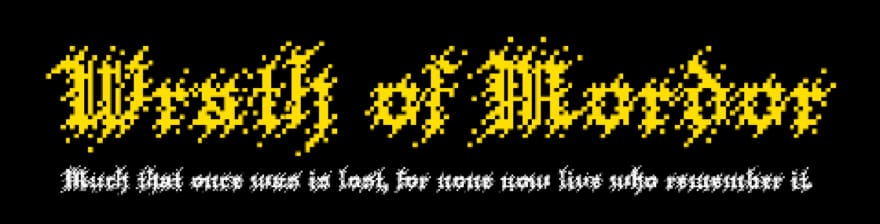
Wrath of Mordor, the font that won FontStruct’s contest, builds on the aesthetics of the Lord of the Rings movies and the games that accompanied them. Its letters have jagged edges that resemble crude torture instruments. Its letters are as easy on the eye in the same way that a serrated blade is easy on the skin.
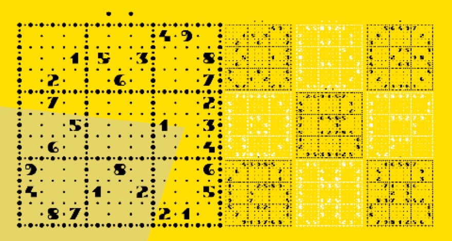
Second prize went to AT Sudoku, a font built out of Sudoku puzzles. Its letters are composed of numbers and blank spaces. If you superimpose a grid, you get a complete puzzle.

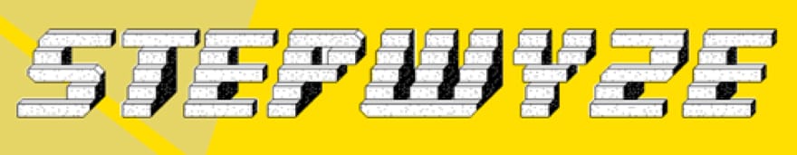
FontStruct’s third prizewinner, Stepwyze, has actually been turned into a game. Its letters are composed of a series of steps. In the platform game of the same name, the player jumps a box from step to step and letter to letter.
Stepwyze speaks to an idea implicit in FontStruct’s contest: font and game design have a lot in common. The primary role of a good font (or typeface) is to help your eye navigate text. Successful typography helps your eyes follow letters, words, lines, and paragraphs without getting lost. In a vacuum, letters are a maze. The distribution of empty spaces and ink (or its digital equivalent) allows us to navigate this maze without getting lost. Indeed, successful typography lets the reader move through documents quickly without sacrificing comprehension.
But, as game designers and players are well aware, sometimes the objective is not to travel from point A to point B as quickly as possible. Whimsy and the joy of the journey matter. In texts, this is why headlines are often printed in more artistic fonts that can be read in small doses. The pairing of typefaces is about the balancing of art and efficiency. This is also a dilemma in game design; navigability is important but can also be the enemy of entertainment. FontStruct’s game fonts are fonts about games but their best uses may not be as fonts. Rather, they are metaphors through which we can understand games.