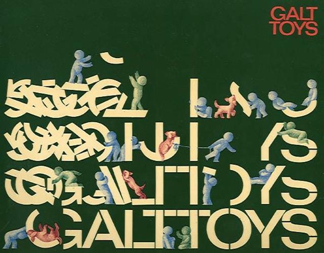
The Eye blog has some amazing images from Galt Toys today in recognition of a new exhibition of Ken Garland’s design work for the manufacturer. Speaking about the work, Garland sheds some light on how toy and game manufacturers began to see their products in terms of the unified design of a branded franchise:
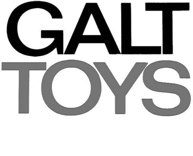
The style was maintained consistently for 20 years. The letterforms chosen for GALT TOYS were from a very recently issued typeface, Folio Medium Extended. The Folio type family was the creation of the Bauer Type Foundry, Frankfurt, then a close rival to the Helvetica and Univers type families.
Garland continues: ‘[We] were determined not to let the Galt Toys logo become a sacred cow, not to be mucked about with (as was decreed with so many logos in the 50s and 60s). It would, indeed, be mucked around with, but only by us.’
t’s an interesting lens into how games and toys with relatively similar mechanics came to have a specific identity linked to their creator and manufacturer thanks in no small part to design. See more of the images here.
[via Eye blog]


