The makers of Monument Valley want to fix your dashboard

A car’s dashboard is a collection of metaphors. You likely don’t know what 60 miles per hour feels like or what a pound-foot of torque is, or why that unit of measurement matters. None of that really matters. These concepts are expressed in the form of dials, which look like timepieces, and you know how to tell time. You can therefore learn to drive in one car and comfortably sit behind the wheel of any other car. This feat is in large part possible because the dashboard’s metaphors act as a universal language.
The dashboard is a universal language.
Of all the times to learn a new language, doing so while barreling down the highway is far from the most opportune. Thus, when it comes to the metaphors used in dashboard design, ease of comprehension tends to trump cleverness. The clock metaphor, for instance, is probably not the most elegant expression of a car’s speed, but it is widely understood. This allows drivers to quickly scan their dashboards, without being distracted from the action on the road.

The universal language of the dashboard, while broadly useful, can therefore be an impediment to progress. There will never be a good or natural time to introduce radical innovations. These challenges lurk in the background of “Are We There Yet,” an eBook about the future of the in-car human-machine interface (HMI) by ustwo, the digital product studio that made Monument Valley. “There is much potential for in-car HMI,” the eBooks’ authors note. Touchscreens and web-based devices have now been widely adopted, replacing dials with digital interfaces in most contexts. “But,” the authors continue, “we have yet to see a similar revolution in the UX and UI of the automotive industry.”
There are compelling reasons why you can’t simply replace a car’s dashboard with a tablet. The gap between analog and digital representations is often bridged by skeuomporphs: digital representations of real-world objects. This tendency has carried over to automotive design. The Tesla Model S’ center console, for instance, is a giant tablet. Thus, as Ustwo’s team notes: “Skeuomorphism abounds, where physical buttons are replaced with lookalikes on a screen – familiarity is retained, but at the expense of tactile feedback.” As visual metaphors, skeuomorphs make it easier to scan a screen but, because they are not tactile, they still require a driver to take her eyes off the road.
What, then, is to be done? Ustwo offers a couple solutions. One option is to use a gestural interface, like that of the Xbox’s Kinect, which would obviate the need for touching a screen. An alternate solution, based on technology being developed by Disney, uses rendering algorithms to create a 3D sensation on touchscreens. “If applied meaningfully,” ustwo notes, “This could allow a muscle memory or ‘feel’ for controls to develop over time.”
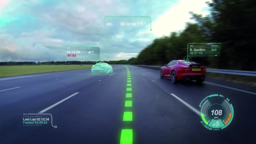
The area with the most potential for improvement, however, is the dashboard’s main gauge cluster. “The instrument cluster as a feedback element has remained fundamentally unchanged since instruments first appeared in cars,” ustwo writes. “Even today with LCD clusters, such as in the Mercedes S-Class, we see the skeuomorphic recreation of these mechanical dials in digital form.” Insofar as instruments don’t need to be touched, skeuomorphs are less problematic in this context. Their use, however, speaks to the automotive industry’s reliance—if not overreliance—on old metaphors.

The virtual dashboards of car games such as Need for Speed or Gran Turismo broadly mimic the design sensibilities and conservatism of the auto industry. Games evolve and compete yet their dashboards and heads-up display remain largely indistinguishable. Round dials abound, all skeuomorphs of the instrumentation of cars from the 1920s. This makes sense insofar as automotive games exist to reproduce the sensation of driving a car that players have little—if any—chance of experiencing in real life. In doing so, driving simulators reproduce and magnify the limitations of dashboard design.
the practice of simplifying complex mechanism into simple shapes
A car’s human-machine interface, argues ustwo’s Tim Smith, “seems to be born out of a separate design stream to that of the?rest of the car and indeed the larger brand.” For instance, Ferrari, a brand synonymous with the colour red, uses the same blue on a black background interface as every other car maker. Some of this is due to usability reasons: the black background minimizes glare. But, argues Smith, “this skeuomorphism seems to bleed into the entirety of the interface, which again pushes any branding into the back seat.” This is doubly the case in videogames, where a Mercedes looks like a BMW and a Need for Speed looks like a Gran Turismo. Most of our experience of cars—virtual and otherwise—is from behind the wheel. The instrument console’s lack of character is therefore sorely felt.
Ustwo has built a prototype instrument console that can be tested on their website. It is based on the notion that the instruments a driver sees should depend on the task that she is performing. Thus, when moving forward, speed is the main focus. It is expressed as an absolute number but also as rising coloured bars or expanding circles, which connote a car’s speed relative to the legal limit. When reversing, however, the most relevant information is what’s happening behind the car. Thus, the cluster shifts to a rear-facing camera. This is a different visual language than the traditional dial but it sticks to the practice of simplifying complex mechanism into simple shapes, like expanding circles and bars.
At the moment, ustwo’s instrument cluster isn’t coming to a car near you anytime soon. It exists as an experiment. Its code can be downloaded and modified by anyone who wishes to do so. So here’s an idea: If innovation cycles in physical cars are slow, as ustwo argues in their eBook, maybe the cluster should first be implemented in driving games. Instruments in these games suffer from the same design pathologies as real cars. If anything they are skeuomorphs of skeuomorphs, a situation that does nothing for anyone. Instead of more of the same, unsatisfying dash, a driving simulator could do well by adopting some of ustwo’s ideas.


