A comprehensive history of low-poly art, Pt. 1

This is the first of a three-part series. Part two is here and part three is here.
1. Past Is Present
In February 1997, Next Generation magazine splashed its cover with an image of a red-eyed reptilian humanoid boasting an Olympian’s physique and a pair of Wolverine-esque knuckle-mounted claws. The creature’s confrontational pose dominated the frame, leaving only enough space for an abbreviated view of a beige stone castle and a murky lime sky behind it.
The creature’s contours were all hard, straight edges rather than organic curves. Its face was a lifeless, scowling mask. The textures on its mottled flesh and the castle’s craggy stones looked equally and obviously manufactured. And it felt as though one could individually count every polygon on display.
Yet a one-word headline doubled as the featured game’s title and the editors’ breathless opinion about the image’s quality: “Unreal!” And lest its readers miss the point, Next Generation tagged on the gushing parenthetical “Yes, this is an actual PC game screenshot… Unreal could be the best looking PC game of 1997.”
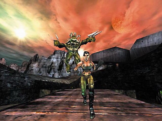
Like many other frozen moments from the past—especially in the realm of technology—this cover image registers as considerably less awe-inspiring in hindsight. No doubt other developers would have sacrificed their pinkie toes to win “Best looking PC game of 1997” over Unreal that February. More than 17 years later, though, the honor and the artwork that earned it both seem as antiquated as an award for “Sturdiest thatch roof” or “Healthiest well water.”
Even so, none of this should be considered an indictment of Unreal’s graphics team. Their work was innovative, if not revolutionary, in its era. Instead, the Next Generation cover represents a more vexing problem for any digital artist: the dysfunctional relationship between time, technology, and our own visual standards.
When it comes to digital artwork, realism is a target in perpetual motion. An artist can only ever get as close to the bullseye as the current technology will allow. Avant-garde game designer Leo Burke summarized the problem as succinctly as possible when I spoke to him over Skype: “With Moore’s Law”—the generally accepted notion that computer processing capabilities double every two years—”and graphics getting better every year, fidelity has a shelf life with games.”
More than 17 years later the honor seems as antiquated as an award for “Sturdiest thatch roof” or “Healthiest well water.”
That fact makes attempting to replicate the natural world a boobytrapped mission for all digital artists concerned with their work’s longevity. No matter how realistic a computer-generated image appears in the moment, inevitably it will soon look both naive and obsolete.
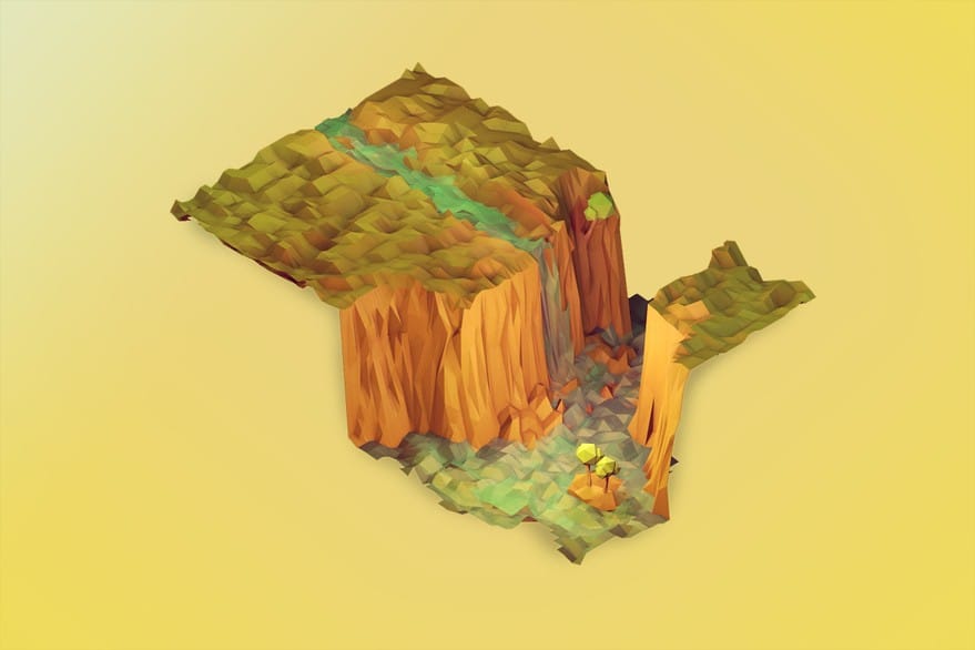
However, Burke is among a new wave of developers and digital artists parachuting back onto the beaches of the mid-‘90s for graphics inspiration. We now know the general style they’re airlifting out—the same basic one as Unreal’s—as the low-poly aesthetic (or just “low-poly,” if you’re in game-familiar company). And the number of operatives volunteering to join the rescue only seems to be growing.
Any outsider looking strictly at the chronology could be forgiven for thinking these artists are volunteering for a suicide mission. As evidenced by a comment thread about the Next Generation cover on Giant Bomb’s forum, the general consensus is that the low-poly graphics of the Unreal era look painfully dated today. (For example, see such retorts to the magazine’s claims as user ch3burashka’s “It seems Next’s April Fools [sic] issue came out 2 months late” and user Scooper’s Oscar Wilde-esque bon mot “fake and ur a bitch.”)
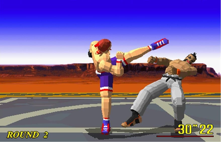
So with nearly two decades of technological progress separating then and now, why would anyone want to exfiltrate low-poly from its captivity in videogame history?
Talking to the developers and artists involved in the effort reveals a range of intelligent answers to this question. And despite the fact that low-poly’s new advocates have few official connections to one another—no joint membership in a bohemian collective, no fiery manifesto to live by, no stylistic instruction manual to follow—their aesthetic choices are driven by a handful of shared motivations that stretch across geographical and national boundaries.
But far more unexpectedly, those shared motivations stretch across generations, too. Viewing low-poly through the lens of art history reveals multiple striking parallels between its evolution and the evolution of Modern art in the late 19th and early 20th centuries. This deeper aesthetic context demonstrates that videogames and digital artwork are simply new media with which to address the same timeless human issues that older art forms have been grappling with for hundreds of years.
To capture all the ways in which low-poly and Modern art rendezvous, though, we first have to dig into what each one means and how they came to be in the first place. Because even in their origins, echoes sound out loud and clear.
///
2. The Paradox of Low-Poly
Understanding low-poly begins with understanding the terminology. And that’s a slightly more complex task than it first appears.
Asking “What does ‘low-poly’ mean?” is a bit like asking “Who’s buried in Grant’s Tomb?” In both cases, there’s an answer that seems glaringly obvious—and yet that answer also entirely ignores the nuance in the question.
While a point of diminishing returns exists, as a general rule, the more traditionally realistic an artist wants any 3D-rendered object to appear, the more polygons she needs at her disposal. The fewer she has, the less able she is to mask that, rather than an actual “object,” the final product is a digital construction stitched together out of individual geometric units.
Between the hardware and the game engines that first enabled 3D-rendered artwork in the mid-‘90s, there simply wasn’t enough in-game processing power to be equally generous with two core components of a game’s visuals: the polygon count and the frame-rate. The polygon count is a mercifully self-explanatory term. The frame-rate demands a little more unpacking, especially in order to grasp its importance in this context.
Like the other forms of motion pictures that preceded them—film, hand-drawn animation, flip books, et al—videogames “move” by bull-rushing our eyes with a progression of ever-so-slightly different still images. The frame-rate describes the speed at which the stills in any “moving image” medium travel. For games, the accepted low speed limit is usually 30 frames per second (fps), meaning the hardware and software together render a new full-screen still every one-thirtieth of a second. Any pace slower than 30 fps risks degrading what should be a smooth visual traffic flow into the type of choppy, stop-and-go affair that incites actual motorists to road rage.
Although it’s slightly reductive, the frame-rate’s relationship to poly count can be thought of as a matter of rationing. With limited graphics resources available in mid-‘90s hardware and game engines, the poly count, and therefore the artwork as a whole, had to languish on table scraps so the frame-rate could be given first dibs. Otherwise, the resulting slow-downs, image chop, and delayed gameplay responsiveness would have transformed early 3D-rendered games into one teeth-grinding episode of coitus interruptus after another.
Cort Stratton, a senior graphics programmer working to maximize PlayStation visual capabilities as a part of Sony’s ICE (Initiative for a Common Engine) group, explained the trade-off in a Polygon story earlier this summer: “For all the games I’ve worked on, the frame-rate target is the fixed point against which all other [graphics] performance decisions are made. If your target is 30 fps, then you cut whatever corners are necessary to hit 30 fps as consistently as possible—reduce the scene complexity, use cheaper/lower-quality algorithms or…render at a lower resolution.”
Think of it as the digital artwork equivalent of a log cabin—the building materials are always on display.
One way to “reduce the scene complexity” is to minimize the poly count. And while present day technology demands fewer, less severe concessions in order to meet frame-rate demands, mid-‘90s technology had to make far more brutal cuts in image quality to do the same.
Hence the reflex response to the question of what “low-poly” means: a visual style forced to make do with a limited number of polygons.
The meager poly count dramatically affects the image’s look in early examples of the aesthetic. Because there are so few units to work with, the polys themselves stay obvious even as an image tries to convince viewers it’s something monolithic. Think of it as the digital artwork equivalent of a log cabin—the building materials are always on display. Next Generation’s February 1997 cover captures many of the resulting signature traits: sharp contours, blatantly geometric modeling, low resolution textures, and generally blunt details.
In contrast, the finest recent polygon-based artwork—something like, say, the Oscar-winning visual effects in Gravity—uses so many polys in a given image that the fiction reads as a seamless, fully-formed whole rather than a sum of visible smaller parts. If mid-’90s low-poly was a log cabin, today’s most naturalistic digital imagery is something like a prize-winning sandcastle; it amazes us partly because its millions of individual building blocks vanish into an illusion of completeness.
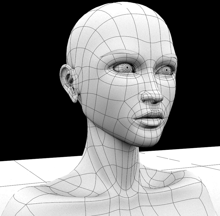
Admittedly, pitting Unreal against Gravity is an unfair fight in multiple categories on the scorecard. First, Gravity runs at a lower frame-rate than the average game—24 fps, the standard for feature films. More importantly, its computer-generated imagery has the advantage of being pre-rendered and simply played back for viewers, whereas in-game imagery faces the far more strenuous processing task of constantly generating in real time. Both factors theoretically leave Gravity more graphics resources to commit to poly count and other image quality boosters, to say nothing of the general influence of Moore’s Law in the intervening years.
But even in a game-to-game comparison, digital artwork’s evolution since low-poly’s first wave is dramatic. For example, a player model in the 1996 PC version of Quake allegedly clocked in at a grand total of 200 polygons. According to Rich Diamant, lead character artist on 2009’s Uncharted 2, Nathan Drake’s in-game model consisted of approximately 37,000. Not only does that make Uncharted 2 a 185X improvement over Quake—it makes Uncharted 2 a 185X improvement that’s now itself five years behind the current curve.
The comparisons above lead us to why the literal definition of low-poly is simultaneously true and false, in much the same way as it would be to answer that Grant is buried in Grant’s tomb. Defining low-poly by poly count only makes sense in a historical comparison. “Low-poly” could not exist as a category until high-poly became an option. But today, it is.
This is not to say that technological constraints no longer apply to the current artists and developers resurrecting low-poly. Limitations still exist. Developer and digital artist Richard Whitelock was careful to underscore this point when I contacted him about his forthcoming low-poly man-against-nature survival game, Into This Wylde Abyss.
“[Low-poly] is quite a broad group,” he wrote. “Some games are still made to restrictive 3D specifications—some current iOS or 3DS games for instance. It also includes those games which attempt to adhere to an older console or engine’s abilities. As well as those which express the more modern ‘low-poly’ aesthetic—such as popularised by Timothy J. Reynolds. It’s only relatively recently that the lighting technology has become readily available in real time engines to make this modern look work.”
“Low-poly” could not exist as a category until high-poly became an option. But today, it is.
But as Whitelock mentions, not all of low-poly’s new wave is triggered by technological pressures. Now many artists resurrecting the aesthetic—including those working independently—have tools powerful enough to embarrass the ones used to render even the most significant studio games of the Unreal era.
And that fact reveals the hidden trick in the low-poly question, the equivalent of the inconvenient truth that no one can be buried in Grant’s tomb because a tomb sits above ground: If the technology is no longer constraining the poly count, then what do we mean by “low-poly”?
The deeper one digs, the clearer it becomes that what Whitelock referred to as the “modern” low-poly aesthetic is less a resurrection than a redefinition—one that begins by disrupting the old standards at even the most literal level.
“Lately, I’ve consciously tried moving away from the term ‘low-poly’ but still find myself using it when tagging work,” Timothy J. Reynolds, the acclaimed 3D artist, wrote to me. “I’d rather refer to the work as ‘3D illustrations,’ and I think that’s a more fitting term, as some of my work is far from low-poly and reaches well past a few million polygons. (I don’t keep count but I check when things get heavy).”
Though Reynolds has never officially contributed in-game artwork, his name is almost synonymous with low-poly’s new wave, as Whitelock’s words support. Nearly every artist and developer I interviewed for this piece mentioned Reynolds as an influence, a collaborator (however briefly), or simply an authority. Excluding him from an in-depth look at low-poly would have been as glaring as excluding John Ford from a film history of the Western.
Whether in his earliest “late night landscape experimentation” works or his more architecturally based recent renderings, it’s easy to see Reynolds’s point about poly count. His environments, characters, and objects demonstrate a level of richness and detail that far exceed the 3D artwork of the mid-’90s and later. They look less like low-poly models of the real world than like high fidelity models of a low-poly world.

Reynolds has stated before that for him, the aesthetic appeal of low-poly lies in the sharp edges and colorful lighting, as well as the challenge of translating organic natural forms into stylized geometric ones. Whitelock seconded both Reynolds’s affection for these stylistic traits and his ambivalence about the broad terminology used to describe the genre as a whole: “‘Low-poly’ really is quite the misnomer—the modern look relies more on a focus on form, lighting and materials than a minimalist approach to geometry and pixel art texturing.”
All of the formal traits highlighted by Reynolds and Whitelock came up again and again in my interviews with other developers and artists. Yet all of them were present in first generation low-poly artwork, too.
Rather than look to poly count then, “low-poly” is perhaps best defined as a style that reveals the unreality of 3D rendering rather than trying to disguise it. The sharp edges, vivid colors, and obviously geometric modeling put the polygon itself on view. And they do so regardless of the date the image was rendered or the number of polys it contains.
Excluding him from an in-depth look at low-poly would have been as glaring as excluding John Ford from a film history of the Western.
The true distinction between modern low-poly and “original” low-poly, then, is intent. There’s a tremendous difference between deploying formal techniques in a rudimentary way out of necessity and deploying them in an enlightened way out of choice. In comparison to the low-poly artists of the mid-’90s, today’s low-poly advocates are primarily doing the latter, even when faced with practical limitations. And they’re doing so despite the fact that more traditionally realistic visual styles are available.
But to make sense of the low-poly movement, we need to move back further, past the 90s. This decision—to create in low poly, even when unnecessary—mirrors ones made in the late 19th and early 20th centuries, when artists began embracing painting as pigment brushed onto canvas rather than an attempt to replicate the natural world. And like the modern low-poly artists, the original Modern artists arrived at the idea to leverage their medium’s unreality even when technological advancement put unprecedented visual fidelity within their reach.
///
3. The Faithful Machine
In January 1839, a prominent French physicist, astronomer, and politician named François Jean Dominique Arago petitioned his government to directly compensate one of his countrymen for a revolutionary breakthrough. This innovation so rocked Arago into a state of utopian idealism that he not only defined the proposed compensation as “indispensable,” but entreated the state to “then nobly give to the whole world”—at no cost—”this discovery which could contribute so much to the progress of art and science.”
Arago’s sponsee was at the time a commercial artist and optical tinkerer most known in his native land for opening a Parisian theater called The Diorama in 1822. Through clever use of transparencies, physical space, and redirected light, the theater’s founder had been routinely astonishing audiences for 17 years with oversized landscape paintings that appeared to transition from day to night, from season to season, and even, at times, to move.
Art historian Robert W. Brown explained the Diorama’s appeal by writing, “If contemporary reactions are to be believed, the highest artistic achievement the diorama could attain was providing an entertaining substitute for reality.” But in the realm of visual fidelity, the theater was only a warm-up lap for the innovation that convinced Arago to advocate so passionately on its proprietor’s behalf.
This entrepreneur and innovator was named Louis-Jacques-Mandé Daguerre. And shortly after the French state heeded Arago’s proposal and granted pensions to both Daguerre and the heir of his deceased collaborator, Daguerre published the step-by-step instructions to replicate his breakthrough. The document described the chemical process for producing what would become the world’s first widely publicized photographic images—humbly christened daguerreotypes.
The technology was an instant sensation. So-called daguerreotypomania blitzed through Paris and soon stormed to the U.S., creating a new industry and a new popular phenomenon along the way. Yet one demographic in particular reacted to the innovation with tremendous anxiety: classically trained painters.
“Highest artistic achievement the diorama could attain was providing an entertaining substitute for reality.”
The advent of photography triggered an existential crisis within the visual arts. It was true that by the time photography emerged, various western European painting academies—an educational concept established in mid-16th century Italy—had been sniping at each other for almost 200 years over whether line or color mattered more to painting.
But the overall aim of formal artistic training had remained unchanged since its inception: Academic painters lived to replicate and beautify nature. Visual fidelity was a high calling only achievable through years of dedication and a healthy measure of innate skill.
The camera detonated this status quo. If the contest was to replicate the physical world, Daguerre’s innovation ensured that any commoner could best even the most polished graduate of the academy using only a simple machine, a handful of easily obtainable chemicals, and a subject capable of staying still for 15-30 minutes. The painter, the draughtsman, the entire concept of the artist as it was then commonly defined, all seemed to have met their extinction event.
Ironically, no one seemed more adamant about the fate of artists than artists themselves. The French painter Paul Delaroche has since been immortalized in art history less for his work than for declaring after his first encounter with a daguerreotype in 1839 that “From today, painting is dead.” Samuel F.B. Morse, who had by then set aside his earlier career as a portrait painter to develop Morse code and the telegraph, offered a more positive but no less absolutist reaction to the technology, calling daguerreotypes “Rembrandt perfected.”
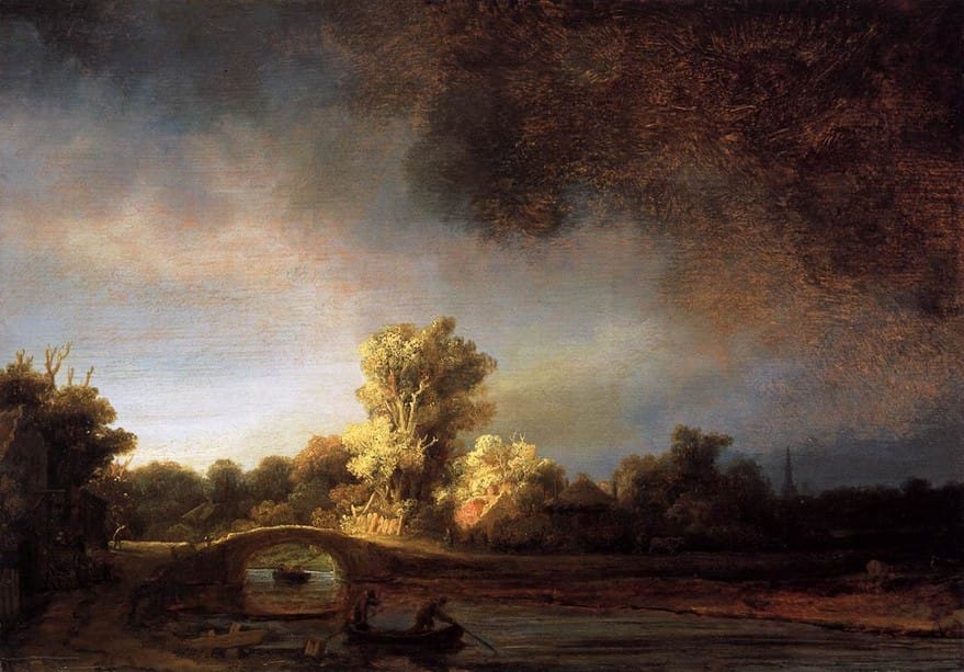
In this sense, early photography mugged academic painting of its claim on visual fidelity in the same way that advancing graphics technology mugged Unreal and other low-poly games from the mid-‘90s. And just as now, some of the most forward-thinking artists of the late 19th century began to consider what the technological revolution meant for aesthetics in the long term.
Clearly, the classical, naturalistic painting style taught by the academies could not rival the camera in terms of faithfulness to the physical world. But maybe that simply suggested fidelity was the wrong metric by which to judge artwork.
Photography thus helped catalyze a radical thesis among certain members of the artistic community: Perhaps what was needed was not replication and beautification of nature but, as Hirshhorn curator Melissa Ho defined it, “an expression of an individual vision.” Instead of merely describing the material world in the idealized terms of the academy, or attempting to beat the camera in the game of visual fidelity, maybe the answer was to provide a subjective, uniquely human point of view.
Paul Gauguin captured the core idea when he advised artists, “Do not copy nature too literally. Art is abstraction; draw art as you dream in nature’s presence, and think more about the act of creation than about the final result.” Edgar Degas put it even more concisely: “Art is not what you see, but what you make others see.”
This ethos drove more and more artists to abandon the classical dogma and seek out their own unique types of graphic innovation. In a sense, these visionaries were “unlearning” the accepted rules of their craft, harnessing a vocabulary paved over by the academy in the interest of accessing fidelity.
Art historians now capture the visual ecosystem created by these figures under the giant glass dome of “Modern art.” The menagerie includes everything from familiar attractions like Impressionism, Cubism, and Expressionism to important niche species like Fauvism, Symbolism, and Futurism—not to mention influential lone wolves such as Gauguin, Paul Cézanne, and Vincent Van Gogh.
In a sense, these visionaries were “unlearning” the accepted rules of their craft.
A rich tapestry of distinct techniques emerged from studios across western Europe and the United States. But just as today’s low-poly artists all embrace the polygon-ness of low-poly, the Modern artists likewise joined in a wholesale abandonment of fidelity to explore painting as painting. Which is to say, they harnessed painting as an evocative representation that leverages its materials and process, not masks them.
Many years after the trend ignited, Picasso summarized this common cause by stating, “Art is a lie that makes us realize truth”—a sentiment that applies equally well to the developers and artists now showcasing the polygon rather than attempting to hide it.
The similarities between the Modern artists and low-poly’s second wave even extend to some of the specific visual traits being featured. Together, Timothy J. Reynolds and Richard Whitelock highlighted colorful lighting, sharp edges, and the geometric re-interpretation of organic forms as particular draws of the aesthetic. Each of these was explored by more than one icon of early Modern artwork en route to their positions in the canon, and in some cases, their status as present-day household names.
For colorful lighting, one can look to Claude Monet and Impressionism, which the Metropolitan Museum of Art defines by “broken brushstrokes that barely convey forms, pure unblended colors, and an emphasis on the effects of light. Rather than neutral white, grays, and blacks, Impressionists often rendered shadows and highlights in color”—a decision enhanced by the nascent commercial production of vivid, pre-mixed paints in the 19th century. Likewise, Henri Matisse in his early Fauve phase “emphasized the use of intense color as a vehicle for describing light and space.”
In comparison to the sharp edges of low-poly, consider Van Gogh, whose “strong expressive lines influenced nearly every artistic movement that came after him,” according to the Getty. The German Expressionist collective Die Brücke offers another reference point via their interest in creating, as art historian Jeanne Willette describes it, “a dynamic blocking-in of forms composed of angular and diagonal lines.”
Today’s low-poly artists all embrace the polygon-ness of low-poly.
And in terms of the geometric re-interpretation of organic forms, Paul Cézanne’s instructions to a young painter in a 1904 letter sound strikingly familiar: “Deal with nature by means of the sphere, the cylinder, and the cone.” Years later, the Expressionist-turned-abstractionist Wassily Kandinsky doubled down on the same notion in even more grandiose terms, writing, “A round spot in a painting can be more significant than a human figure … The impact of the acute angle of a triangle on a circle produces an effect no less powerful than the finger of God touching the finger of Adam in Michelangelo.”
While the academies viewed these unrepentant stylizations as naive, childlike, or simply vulgar, Modern artists recognized the possibilities in this new brand of visual honesty. Counterintuitively, what they realized was that individual expression held more power to connect with an audience than fidelity.
Today, developers and artists in the second wave of low-poly are reaching an identical conclusion. And the results are equally engaging for the same reasons. This notion becomes much stronger when the two are compared in detail side by side—not just in their origins vis-à-vis higher fidelity technology, but in their parallel emotional goals and motivations.
///
Header image via Jochem Oogink
Third in-line image via Valterri Maki
Bear (fourth in-line) and landscape image (sixth in-line) via Timothy Reynolds

