A comprehensive history of low-poly art, Pt. 2

This is the second of a three-part series. You can read part one here and part three here.
4. The Devil in the Details, The Blood in the Basics
The Modern artists discovered that, rather than just contributing to an imperfect replica of reality, every formal attribute of an artwork could become a circuit for transmitting deeper meaning. But the image had to be stripped down to its essence to achieve this goal: colors acknowledged as colors, lines acknowledged as lines, geometric forms acknowledged as geometric forms. In short, true expression demanded the flawed costume ball of fidelity be unmasked.
Early photography helped catalyze this epiphany not just because of what it provided but because of what it did not. Although the new medium was met with widespread popular acclaim for its faithfulness to reality, that same faithfulness registered as cause for discomfort even among some citizens who, unlike academic artists, had no professional stake in the matter.
The friction was simple: As clinically realistic as photographic images looked, to detractors they felt cold, impersonal—even unnatural. The Library of Congress’s history of the daguerreotype in the mid-19th century notes that “despite its value as a means of memorializing friends and family, photography did not have an immediate market [in the U.S.] In fact, it was photography’s almost magical ability to reproduce life that elicited fear and suspicion from many people.”
true expression demanded the flawed costume ball of fidelity be unmasked.
This anxiety was popular enough to find its way into notable fiction of the era. First published in 1851, Nathaniel Hawthorne’s The House of the Seven Gables includes a key character named Holgrave who descends from a line of alleged warlocks—a genealogy that grants him the power to hypnotize unsuspecting victims with his gaze. Holgrave’s occupation? Daguerreotypist.
Even less subtle was an anonymous short story called “The Magnetic Daguerreotypes” published in the June 1852 issue of Photographic Art-Journal. The tale revolves around an insidious professor who tweaks the daguerreotyping process so that the plates become permanent psychic windows onto their subjects’ thoughts. The story is sometimes identified as the beginning of the myth about photography’s ability to steal souls.
Less sensationalistic but no less intense resistance even came from within Daguerre’s home country. Charles Baudelaire, the legendary French poet and art critic, eviscerated the new medium in his 1859 essay “On Photography.” He judged that the technology “contributed not a little to confirm stupidity in its faith and to ruin whatever might remain of the divine in the French mind.” As if that wasn’t enough, he also equated the public’s widespread interest in it to “a disease of imbeciles.”
But the crucial point in Baudelaire’s essay is not just to savage photography’s practitioners or fan base (though he does plenty of both). It is to forcefully separate Daguerre’s invention from art. To Baudelaire, photography was only an “industry,” i.e. a technological innovation—no more a gateway to “the most ethereal and immaterial aspects of creation” than the microscope—and anyone arguing the opposite was not only a moron but a menace to mankind.
Given this context, it’s easy to understand why the era’s avant-garde artists felt compelled to pursue radical simplicity and expressiveness in their work. Taking painting back to basics allowed them to produce images that countered photography’s ice storm of realism by stoking fires of real human emotion. Paul Gauguin alluded to this strategy in 1885: “I feel more than ever convinced that there is no such thing as exaggerated art. Indeed, I think there is only salvation in the extreme—every middle way is mediocre.”
A similar interest in mindful deconstruction often guides the thinking of contemporary low-poly designers and artists. For instance, when I spoke to Teddy Diefenbach—game designer and co-founder of Rad Dragon, among other ventures—about his in-development one-hit-kill opus Kyoto Wild, he partially credited its stylized look to a distillation process that would have made the Modern artists proud.
Kyoto began as something between a riff and a side project during Diefenbach’s work as a member of Heart Machine on the upcoming Hyper Light Drifter, which reinterprets 8-bit and 16-bit pixel art RPG classics. And while he had no direct hand in developing the look of Hyper Light, it served as a firsthand example of the visual power of simplification.
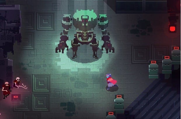
“We started with a higher rez version and then dialed down to pixels,” he told me. “[We realized] the fewer the pixels, the more time you could spend on colors, gradients, overlays, lighting, FX.” Rather than higher fidelity, these more elemental aspects were what excited the Heart Machine team about the game’s graphics, not to mention what held the potential to set Hyper Light Drifter apart in a crowded marketplace.
It was a valuable lesson for Diefenbach. When he started developing Kyoto Wild, he had never been solely responsible for the artwork in one of his games. But he reasoned that the same stylized minimalism that energized Hyper Light’s pixels should do the same for Kyoto’s polygons. So he deliberately muted the siren song of a higher poly count in order to amplify more foundational aspects of the game’s imagery.
Diefenbach now points to the contrast between hard-edged polygons and soft light as a defining attribute of Kyoto’s visual signature—an interplay that would be snowed over by naturalistic detail had he chosen a less Modernist path for the game’s look. In fact, he even laments one of the current screenshots on his Kyoto site because it features a “rookie mistake”: one tree with a noticeably higher poly count than the rest of the visual field.
Nevertheless, his overall approach still gels with early avant-garde artists such as Picasso, who once declared that “art is the elimination of the unnecessary.”
Similarly, Whitelock’s decision to thoughtfully streamline Into This Wylde Abyss’s artwork stems in part from his past experience in the lengthy, chaotic development process of nearly 20 different games, particularly studio titles. “There is often a period on larger projects where the 3D environments are still largely made of bare geometry which, even with only a rudimentary lighting pass, can look quite striking. The addition of detail for the sake of it can actually reduce that impact.”
Essentially, Whitelock is advocating that high visual fidelity can be more liability than asset. He believes that to maximize low-poly’s impact, one must reduce the imagery to its essence, just as the Modern artists did in painting. “Without extremes in detail and visual noise there is real space to indulge in light and atmosphere,” he wrote.
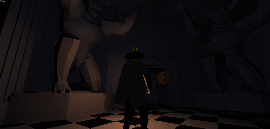
Whitelock spoke to an even more substantive Modernist parallel when I asked him about the advantages of impressionistic (lower case “i”) artwork rather than the would-be realistic variety. “‘Impressionistic’ is certainly the right word. In some games the most important consideration is mood. Increasing detail resolution beyond a certain point doesn’t improve the power or sense of mood conveyed—or at least it does so with rapidly diminishing returns. If everything is spelled out in meticulous detail then there is less space for a player to involve themselves and their imagination.”
The crucial point is that this approach transcends formalism. Yes, by clear-cutting what Picasso would call “unnecessary” details, an artist can free the basic elements of any visual medium to breathe and flourish in striking ways, just as Whitelock and Diefenbach suggest. But for the Modern painters, art was about more than just how the work looked. It was about how the work felt. It was about creating a deeper, more powerful interactive experience than fidelity could ever hope to provide.
Instead of offering an audience something “complete” then, the key for the Modernists was to leave conceptual room in their pieces for viewers to participate. Gauguin nodded to this approach when he advised that in painting “one must search for suggestion rather than description.”
The same sentiment is helping to motivate second wave low-poly. When I spoke to Blendo Games founder Brendon Chung about the origin of his quirky but captivating first-person adventurer Gravity Bone, he too traced a direct path between low-poly’s stylized simplicity and its ability to invite players into a deeper engagement with the experience.
Paradoxically, Chung told me that he began developing the game from nothing but the kernel of an ending: the protagonist being jolted off a skyscraper, replaying random moments of his life in flashback as he falls (presumably) to his death. And while Gravity Bone grew from that narrative seed, it didn’t necessarily grow easily.
Part of the challenge was that, like many of my other interviewees, Chung had little-to-no prior experience as a 3D artist. He’d only ever dabbled in hand-drawn animation. So as he tried to build something resembling a semi-naturalistic first person world with an abbreviated tool set, he found himself bumbling through tripwires that a veteran digital artist would easily have evaded.
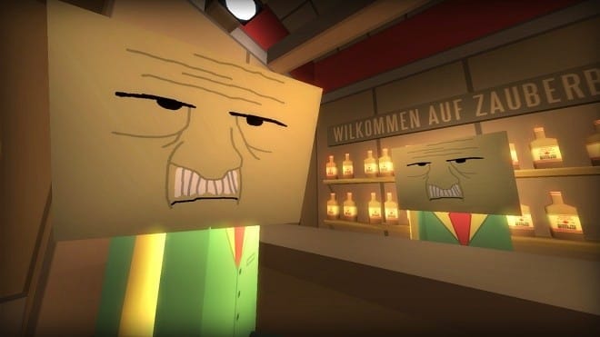
“I started rendering people with nicely shaped calves and arms that rotated correctly, and it looked like super garbage—like someone was trying and failing,” he told me. So in a moment of frustration, he simply plopped a giant cube over the head of the character model he was working on… and the move changed everything. Voila: simplicity.
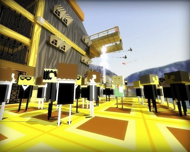
To hear Chung tell it, the game started to gather momentum off this accidental shift toward stylized visual clarity. “Part of the reason I really like [this version of] low-poly is that it’s very readable,” he said, echoing Diefenbach and Whitelock. “Extremely detailed stuff on top of extremely detailed stuff… it all kind of becomes a blur of brown and grey pixels. Everything blends into everything else. Low-poly gives you these giant blank canvases, so it becomes easier to emphasize things like, ‘Oh, that door is gonna move.’”
But the advantages go deeper than legibility. Chung also linked the graphic style back to a particularly influential section in Scott McCloud’s book Understanding Comics, where McCloud breaks down the relationship between the level of visual refinement and the strength of authorial intent. Chung summarized: “When you make a really detailed face… you’re basically saying ‘This is exactly how this character feels.’ But when it’s just two dots and a line for a face, [the viewer] gets to fill in the blanks. There’s room for them to participate.”
The end result was Chung’s own spin on a low-poly first-person adventurer: what I would call Legoland noir, a self-consciously cubic world where darkness counterbalances whimsy and you can get shot in the back over a roll of songbird negatives. The game is both familiar enough to be inviting and fresh enough to keep players fully engaged, as it quickly becomes clear they have no idea what to expect next.
And as Chung sees it, that’s the point. “When I play [a lot of] games, I feel like they’re so intent on explaining everything,” he said. “I want to give players opportunities to come up with their own conclusions. I want to give them a chance to discover things.”
In the process, Gravity Bone’s artwork helps define the soul of the game, not just the imagery. Low-poly acts as a gateway to experience. And when used in this way, the aesthetic parallels the highest goals of the Modern artists in the late 19th and early 20th centuries. As Kandinsky scolded in 1910, “Lend your ear to music, open your eyes to painting, and … stop thinking! Just ask yourself whether the work has enabled you to ‘walk about’ into a hitherto unknown world. If the answer is yes, what more do you want?”
///
5. Lights in the Rearview
Yet if both low-poly’s second wave and the first Modern artists honed their visual choices to enhance audience interaction, another question emerges: What exactly did they want their audiences to experience?
The answers range depending on the work in question and the precise goals of the people creating it. But the breadth and depth of possibilities clarify why more and more advocates gravitated toward both movements as they developed—and why contemporary low-poly has a chance to resonate across time in the same ways as Modern art continues to.
One particularly nuanced case study is Skipping Stones, a generative music project hibernating amid Montreal game-making collective KO-OP Mode’s development slate. In the vein of Ed Key and David Kanaga’s lauded Proteus, Skipping Stones was essentially engineered to simulate the experience of laying down one’s concerns to explore and reflect in nature. But unlike Proteus, whose signature look largely relies on an intentionally frayed patchwork of pixels, Skipping Stones uses a stylized low-poly aesthetic to enhance the meditative effect.
On one level, it’s a game that designer Saleem Dabbous would prefer he never had reason to develop. He explained to me over Skype that much of Skipping Stones’ genesis lay in personal tragedy—or more accurately, in trying to cope with it. After a sudden and devastating loss, Dabbous found some degree of solace in frequent walks on Mount Royal, a triple-peaked greenspace rising just west of downtown Montreal.
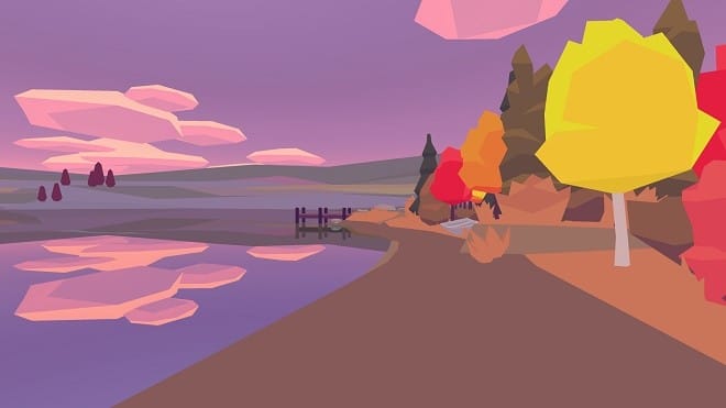
Dabbous described how on his ascents, there would eventually come a moment where the fog on the hill completely blanketed his view of the city, allowing him to “get lost in nature.” Although his strife didn’t disappear with the high-rises, his immersion in the landscape granted him a measure of, if not exactly peace, then at least perspective on recent events. Skipping Stones was meant to translate that experience into an equally soothing digital package.
However, Dabbous originally wanted the game’s graphics to echo not low-poly but a more unorthodox PS1-era aesthetic, which he described to me via email as “kind of Vib-Ribbon inspired but in 3D.” On the recommendation of a mutual friend in the Montreal game community, he met with a digital artist named G.P. Lackey to discuss the idea.
Two years later, Dabbous credits Lackey, now one of his closest collaborators at KO-OP Mode, with pushing the artwork into low-poly territory instead. The style’s evocative potential naturally synced with the game’s concept. And at the time, second wave low-poly as a whole was nearly as unexpected as the alternative Dabbous originally had in mind—an idea he now laughs off, given the explosion of interest in the aesthetic since.
Nevertheless, even today Skipping Stones’ look stands out within the genre, and it does so partly because it is knowingly influenced by Modern art. During a Skype conference with Dabbous and me, Lackey explained that he brewed the game’s low-poly artwork through the filter of the Canadian Modernist landscape painters known as the Group of Seven. He noted that he “saw similarities between the way [the Group of Seven] rendered shapes and the way 3D art could look, in a suggestive sort of way—the overall coloring and shading.”
Lackey was particularly inspired by Group of Seven member Lawren Harris’s work. Review a collection of his paintings, and it’s not difficult to see why. The images abound with stylized geometry, hard edges, and perhaps most notably, a type of bold coloration and smooth modeling reminiscent of flat-shaded polygons.
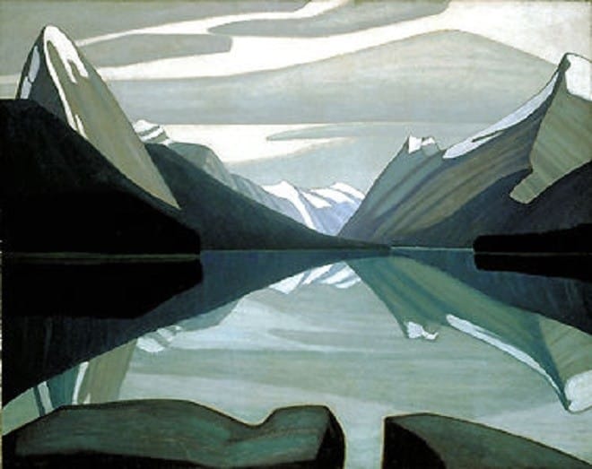
“One of the nice things about doing artwork that’s flat-shaded is that you don’t have to deal with texturing, which takes a ton of time and still doesn’t look that great,” Lackey explained. “Very few games for PS1 were actually flat-shaded. They usually tried to texture everything, and it didn’t age very well.”
Not coincidentally, texturing in 3D art can be thought of as a kind of anti-Modernist camouflage. The technique’s purpose is to try to hide the fact that the player is looking at a digitally rendered polygon rather than an “actual” object. The problem, as Lackey points out, is that it tends to backfire.
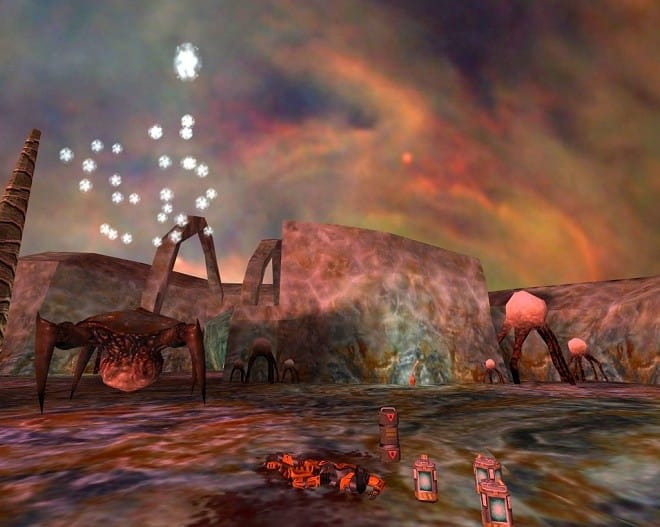
For evidence, we can again look back to Next Generation’s February 1997 Unreal cover. With the possible exceptions of the legally blind and the perilously intoxicated, no human being would ever mistake the faux flesh and uniform stone on display there for the real things—another example of how flailing for greater naturalism can be its own sabotage.
The same could be argued about organic, real-time lighting. Lackey spent a year trying to build this feature into the artwork for Skipping Stones, but eventually realized that this ostensibly higher fidelity attribute might be the problem rather than the solution. “It just looked off,” he said of the earlier version. So he scrapped it and took a different tack, aiming instead to “embrace the computer-ness” of the look.
As a result, Skipping Stones rejects “true” lighting. The passage of time plays out through the colors embedded in the flat texture of every polygon on screen. Changes in the “light” are actually just dynamic cross-fades between the different textures.
“That ended up bringing it closer to Lawren Harris and the Group of Seven because I had control over every color [instead of relying on lighting],” Lackey said. “It was about controlling [the art]… at an atomic level.” Rather than fight against the medium’s unreality, he “could take what 3D art does well and play to that strength,” just as Harris and his Group of Seven allies did with Modern painting almost a hundred years ago.
While Diefenbach’s motivation for creating Kyoto Wild was of a completely different tenor than Dabbous’s, it was still very much emotionally driven. He built the earliest iteration in 24 hours for a game jam at Glitch City, the LA-based art and game design co-op he helped found. The ticking clock that the event imposed on the development process only accelerated the free-flowing impulses driving him. “I just wanted to do something simple. I wanted to put in a bunch of things I loved and see if they fit,” he told me.
The artwork was a crucial link in the chain. Diefenbach claims not to have set out to make Kyoto low-poly for low-poly’s sake but rather for synergy with the rest of the game’s content. He pointed to the the PS1 death-at-first-strike classic Bushido Blade as the project’s north star. It only seemed right for Kyoto’s visuals to nod to the look of its model rather than just its mechanics.
Diefenbach partly pinned his reach back to the past on a “natural gestation process” all artists go through as they develop. “I think it takes about 10 years to make something you care about, so some of what really mattered to you 10 years ago is probably going to creep in somehow.”
But he was chasing more than just the simplicity of Bushido Blade. He was chasing the pure enjoyment of playing the game all those years ago. He mentioned the “emotional attachment” he felt towards his favorite first generation low-poly titles, and the more we talked the clearer it became that his goal was to smuggle the raw uncut joy of his youth over the border and into the present.
Nor is Diefenbach alone in running such an operation. Timothy Reynolds has previously credited part of his interest in the low-poly aesthetic to growing up on “a healthy dose of Legos and cartoons.” When I asked him specifically about nostalgia’s impact on his practice, he wrote back, “I love feeling nostalgia for old toys, videogames, movies, etc. but I haven’t really messed with that area in my work. Well, besides that one EarthBound piece I did for a group show about pre-1995 gaming. That game will always have my heart. Ok and that one ‘80s Fisher-Price barn piece I did. So, ok, I do love nostalgia.”
Chung expressed a similar sentiment in regard to Gravity Bone. He told me that, after being severed from his job at a major game studio, he “wanted to dive back into the stuff [he] grew up on,” specifically the mods for first wave low-poly classics like Doom, Quake, and Half-Life that comprised some of his earliest game design experiences.
That impulse that led to the formation of Blendo Games and later, the birth of Gravity Bone. And although Chung’s visual re-interpretation of his predecessors may be more dramatically stylized than Diefenbach’s, neither is slavishly copying the look of his models. Instead, each is adapting select visual elements from the past in order to craft something new.
Yet the feeling of the originals survives, even thrives, in the present. The nostalgic ideal leads to contemporary twists that spark a kind of emotional sense-memory rather than an “accurate” remembrance. In this way, today’s low-poly designers and artists are choosing only the most favorable strains of the aesthetic to cultivate a specific emotion or experience, similar to how farmers sow their fields with seeds from the hardiest and plumpest crops to yield more of the same in the next harvest.
As Whitelock wrote when I asked him about nostalgia’s intersection with the new low-poly aesthetic, “I think many [designers and artists] want to evoke the past but at the same time many players don’t actually want to remember how [low-poly] really was. At lower resolutions, with coarser lighting, cruder material response—or rather ironically—with too low of a polygon count, this look doesn’t work as well.”
Lackey brought up a similar idea during our conversation. He noted that, rather than a strict revival, the second generation of low-poly tends to be “a re-interpretation of actual PS1-era stuff, whereas pixel art can get really purist.” And it’s also worth recalling Reynolds’s mild discomfort with the term “low-poly” because of the sometimes millions-strong poly counts in his work.
Together, these comments form one of the keys to unlocking contemporary low-poly: Nostalgia is only a starting point. The look and feel of the new artwork idealizes the past to create novel experiences. And in this exchange, we find another wormhole leading back to the Modern artists, some of whom crucially (if controversially) exploited a form of selective cultural memory to develop portions of their own avant-garde styles.
While photography agitated late 19th and early 20th century artists on its own, it was also just one muscle in a larger, more powerful appendage reshaping attitudes and ideas throughout western culture at the time: industrialization. Since the machine-enabled disruption of the textile industry circa 1740, rapid technological progress had thrown the human experience into a state of continuous churn at even the most basic levels.
For once, it isn’t hyperbole to declare that everything changed. Industrialization altered the job market and expanded the economy, giving rise to the middle class and a new lifestyle that came with the designation. Populations became concentrated in cities to an unprecedented degree, as everything from the types of buildings to the living conditions within them transformed.
Inventions like the lightbulb upended humanity’s relationship with time, while developments like the locomotive and the telegraph recalibrated the concept of distance. And of course, photography shook the visual arts to its bone marrow.
The earlier mentioned pockets of unease around photography were only one offshoot of the larger existential crisis triggered by this barrage of innovations. For many in the 19th century, this slate of upheavals made life both infinitely more complex and infinitely less familiar. Mankind suddenly faced questions and problems it had never faced in its history.
Discomfort, fear, and even outright resistance manifested throughout western culture. Politically, it could be seen in industrial machine-breaking protests, such as the Luddite Uprisings of 1811-1813 and the Captain Swing Riots of the 1830s. In literature, it led to the publication and popularity of allegories about the perils of advancement, such as Mary Shelley’s Frankenstein in 1818 and Robert Louis Stevenson’s The Strange Case of Dr. Jekyll and Mr. Hyde in 1886.
But within Modern art’s multi-faceted response to the zeitgeist, the aspect most relevant to low-poly and nostalgia was the rise of so-called “primitivism.” The term defines western artists’ widespread fascination with non-western and tribal art. Even more so, it defines the Modernists’ interest in actively re-interpreting certain formal qualities of non-western art into their own works.
The trend gained currency among artistic giants like Picasso, Henri Matisse, and especially Paul Gauguin, some of whom positioned tribal cultures not only as models for how to paint but as models for how to live. As the Guggenheim notes, the “primitive” was seen “as a myth of paradise lost for late-19th and 20th century culture.” The argument went that the complexity of industrialized, urbanized life had divorced mankind from its essential humanity. These foreign cultures, free of the corrupting influence of modern progress, provided a template for returning to our noble roots.
The problem with “primitivism”—and the reason the term is so fraught in contemporary times (hence the scare quotes)—is that it treated non-western cultures more as a projection screen for western artists’ desires than as a topic of rigorous study. While at the time it was allegedly intended as, if not a compliment, then at least a value-neutral term, today “primitive” carries unavoidably prejudiced undertones when used as a synonym for non-western demographics. Even a “noble savage” is still a savage.
The crucial point, though, is that the Modern artists celebrating “primitivism” were celebrating an idealized adaptation of the past, not a truthful accounting. Consciously or subconsciously, they plucked only the most appealing aspects from their reference points, then spun them to create new works that tapped into a feeling that resonated with western viewers of the time. To the extent the artists thought about it, the ends justified the means.
Gauguin was the ultimate example of this trend. Though he ostensibly relocated from Paris to Tahiti in order to immerse himself among a purer, more liberated people who “live only to sing and make love,” more recent research suggests that his Pacific island existence was far tamer and more westernized than his late work and his bluster let on.
But again, literal truth was inconsequential. What mattered was the evocative power of the narrative and the art that sprung from it. The idealized version of mankind’s shared past was more important than the reality.
Although contemporary low-poly’s curating of the past involves none of the ethical tire spikes of “primitivism,” the thematic parallels to the Modern artists are still powerful. Similar to Gauguin’s singing the praises of an ideal more than an actual reality, some of the decision to re-interpret low-poly is fueled by the same craving to simplify and connect in a hyperactive era.
In this regard, low-poly’s rebirth is to some degree an extension of a much larger nostalgic trend in videogames and digital artwork. Not only has there been an avalanche of pixel art in recent memory, from Heart Machine’s aforementioned Hyper Light Drifter to digital artists like Lackey in the non-poly section of his portfolio, but some of the actual classics have also been re-appearing in unexpected ways.
photography shook the visual arts to its bone marrow.
For instance, Tom Kail of UK game-making collective Knick Knack mentioned to me that there are “lots of retro gaming bars popping up in London, and they’re always packed! People want that experience of Super Mario or Sonic again.” Unprompted, he added, “It’s a form of nostalgia. People want to get back to simplicity.”
This observation influenced Kail and his collaborators in terms of both the artwork and the mechanics of their in-development project Biome. Knick Knack describes Biome on its dev blog as a “digital zen toy,” not a game. It presents the player with an isometric slice of low-poly landscape whose features continually morph in response to where she clicks. Think of it as something like a God version of a Rubik’s Cube, only with no “solution.”
To hear Kail tell it, the low-poly graphics feed into the team’s desire to make Biome as inclusive as humanly possible. “I love the contrast of low-poly. You’re so aware of how everything fits together. You get a very clear understanding of what the world is and what you can do within it.” And that applies to everyone, not just people who regularly play games—a notion he summed up by stating, “My mom can play Biome.”
Kail sees the project’s cross-demographic, all-ages appeal pivoting on the same simplicity as the classics now drawing Londoners to retro-gaming bars. Much like Gauguin painting idealized Tahitian village scenes in a “primitivist”-inspired style and advocating for a purer way of life, Kail just wants players to set aside the complications of their hectic modern existence and get blissfully lost in another world.
The same is true to varying degrees for KO-OP Mode, Diefenbach, Reynolds, and Chung. The nostalgic undertones in their work are not only complementary to their low-poly visuals, they are symbiotic—self-reinforcing elements designed to connect with players on an emotional level.
All of which parallels the Modern artists’ endorsement of emotional truth over literal truth, especially when it comes to the past. The memories embedded in the new low-poly allow the style to access a greater meaning and a greater experience. Picasso is again worth quoting: “Painting is a blind man’s profession. He paints not what he sees, but what he feels, what he tells himself about what he has seen.”
///
Fifth in-line image via The Canadian Encyclopedia

