These are great times for the weird internet, which is a little strange because it’s all so respectable. Sure, there are still genuinely weird sites like oj.com, but they are weird precisely because they are retro. It’s probably for the best that we don’t live in the era of make-your-own-Geocities and frames, but what have we lost along the way and does it have any aesthetic value independent of our nostalgia?
83M80 — Letterpress in the Digital Era, a documentary by Gonzalo Hergueta and MRKA, attempts to address what has been lost in the move towards a more professionalized internet. Its focus is specifically on typefaces, but many of the points made in 83M80 could apply in other contexts. Through interviews with designers, it becomes clear that technological advances have paradoxically given designers greater control over their creative outputs while also creating greater pressures to achieve a perfected look. What’s the point of greater control if you can’t create glitches without it being interpreted as an act of dissent?
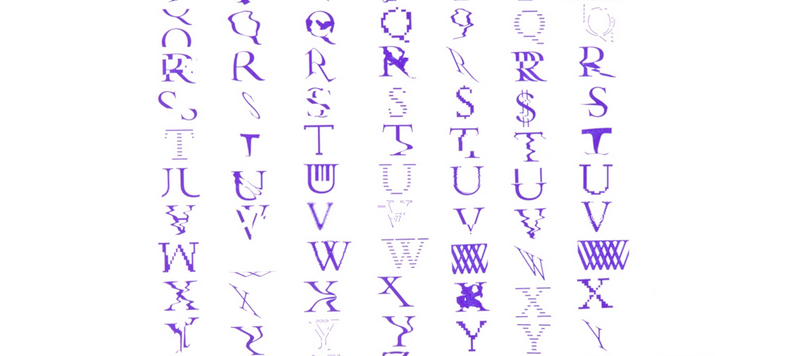
Things weren’t always this way. Indeed, 83M80 argues that most of the digital age has been characterized by a high tolerance for imperfections. It was not possible for early screens and processors to render typefaces as any more than rough forms, and so we accepted that. What else was there to do? Yet that acceptance was not usually reluctant. Early digital typefaces were appealing in their own strange ways. Sure, you may not have wanted to read War and Peace in their streaky glyphs, but they had a personality.
83M80, the typeface that accompanies the documentary, is an attempt to honor the early days of digital typography. It applies a variety of digital distortions to Bembo, a decades-old serif typeface. Some letters have the undulating forms you get from CRT TVs, their lines zig-zagging like a televised polygraph. Others take on the look of corrupted data, with chunks randomly appearing out of place or staggered. One of 83M80’s most compelling distortions is what its creators refer to as “low res,” a look reminiscent of the pixelated letterforms in early CRT videogames. These letters may be harder to read than more recent alternatives, but they more efficiently express context. That seems like a fair tradeoff.
Hergueta and MRKA have thus far used their typeface in exhibits after printing it with an old-school letterpress. The relief of the letterpress creates a strong and compelling contrast with the typeface’s digital influences. The pair has also made a beta version of the font’s digital edition available to a select few designers. 83M80 is unlikely to take over the world, but, in a sense, the various ideas it references once did.