Firewatch’s design is rich with American history
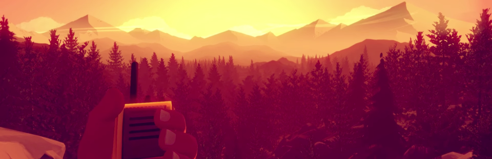
Suffused with the hazy reds and oranges of a western sunset, the first video of Campo Santo’s Firewatch was an unexpected treat. Set in the wilderness of Wyoming, the game is set to follow Henry, a fire lookout, through forests backlit by the sun and up and down blue-gray mountains of stone. The colors in the trailer are what immediately grab you, and it’s easy to see the graphic designer Olly Moss’s influence shining through. But what I saw more clearly was unexpected. Firewatch looked like something straight out of the New Deal.
When Franklin D. Roosevelt launched the Works Progress Administration in April of 1935 to pull America out of the Great Depression, he created a program that would give jobs to nearly 8 million people between 1935 and 1943. They built community structures all across the nation. There were new bridges, new buildings, murals and roads. They constructed libraries and excavated historic sites. A great deal of what they built to keep themselves busy and employed are still in use today. But within the WPA was a smaller group of projects collectively known as Federal Project Number One. And inside Federal Project Number One was the Federal Art Project.
Federal Project Number One was Roosevelt’s way of supporting those with a less conventional means of earning an income during the Great Depression. There were artists out of work too, and no one has much use for actors and writers when they have no money to spend on trips to the theater or leisure reading. Their plights could either be ignored, or the government could find a way to put their talents to good use. And so Federal Project Number One was founded as part of Roosevelt’s Second New Deal. It was the largest of the Second New Deal’s projects, and created jobs for those employed in the arts, including some of the biggest names in 20th century art. The Federal Writers Project employed John Steinbeck, Zora Neale Hurston, and Saul Bellow; Orson Welles and Arthur Miller got their start with the Federal Theater Project; brothers Charles and Jackson Pollock were supported by the Federal Art Project before they could support themselves.
The poster division put out over 2 million posters in their time
Since they were working for the government’s dime, most of the artists and writers employed by the WPA worked on promotional materials geared towards getting Americans out into their communities and giving back. The economy can’t grow if people aren’t out there putting money into it, and so specific projects were created to promote travel across the nation, or even just across the state. And although they are less well known than the prominent WPA-funded murals that a lot of America’s small towns feature, the national park posters created by the artists of the FAP are some the most striking pieces of marketing to come out of the New Deal.
The early posters commissioned by the WPA ranged in subject from scenic state highways to symphony promos. The poster division put out over 2 million posters in their time, all based on 35,000 designs. But paper is fragile, and in hindsight we always wish we would have saved more from the past. It probably did not seem nearly important to them to preserve their work as it does to us now. Only 2,000 of the 35,000 original designs remain to us today, representing a loss of 99.9% of our public poster art. At its peak, the poster division had outlets in 48 of the 50 states, and the Chicago units were putting out up to 1,500 posters a day in eight colors each for about ten cents a poster. It was a well-oiled machine.
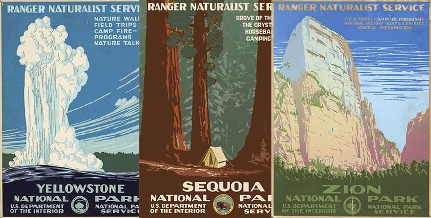
The National Park Service poster program was launched in August 1938 by Dorr Yeager. Yeager was the assistant chief of the Museum Division of the Western Museum Laboratories at the time, and took on the task of heading up the new initiative staffed with WPA artists. In a letter dated August 26, 1938, to Frank Pinckley of Southwestern Monuments, Yeager called for requests for park posters and included a preliminary sketch of the now-famous Jenny Lake Museum/Grand Teton poster. It, along with ten other drafts that Yeager sent out were meant to encourage the national parks to commission their services. Ultimately, only fourteen national park designs were produced. Bandelier National Monument was the last one, completed in 1941.
And then, they were all just kind of forgotten. The fragile nature of the silkscreens used at the time would have limited the amount of prints made from each one to between 50-100, all of which were most likely distributed to the parks themselves and then to the local chambers of commerce. After they stopped being produced, what remained of the park collections were sent to the parks who commissioned them. They were used or discarded, stored away in filing cabinets, where they slipped everyone’s minds.
They’re simple and striking, with very clear lines and crisp views
In 1973, one of the Grand Teton posters was found headed for the park’s burn pile. And then in Harper’s Ferry, West Virginia, thirteen black and white negatives of the posters were discovered. Doug Leen, seasonal park ranger and self-appointed leader of WPA park poster recovery effort, was the one digging the negatives out of the National Park Service archives. With the reconstruction effort being spearheaded, more and more posters began to turn up. Two Mount Rainier posters were found in a garage near Seattle, and a third turned up a year later in its original frame. When they removed the frame for cleaning, they discovered it was actually three posters shoved in the frame together, the middle one being in pristine condition. After that, several of the southwestern parks began searching their own archives for the posters. Thirteen posters were found in Bandelier National Monument where several had actually been cut up to use as file dividers. Thirty three originals in total have been found, with three missing or unaccounted for: Wind Cave, The Great Smoky Mountains, and Yellowstone Falls.
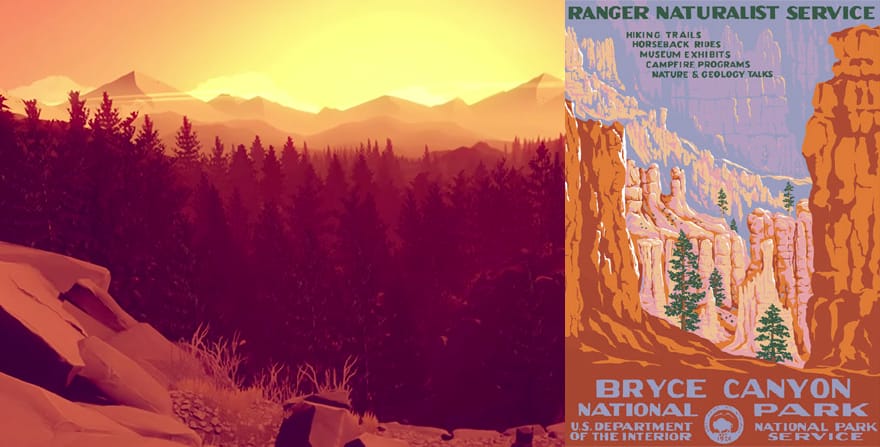
Doug Leen and his team now work to reproduce the colors and style of the original posters as faithfully as possible. A great deal of the parks who were part of the initial FAP park poster effort have commissioned new posters done in the style of the originals from Leen, or “Ranger Doug,” as he is referred to on his website. The recolorations on the reproductions look flawless, and graphic designer Brian Maebius stays true to style. A lot of the posters used very few colors, only up to eight per poster. Only the Petrified Forest poster had nine colors. They’re simple and striking, with very clear lines and crisp views. Very much, in fact, like that opening scene of the Firewatch trailer.
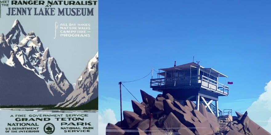
Look at the original Grand Teton poster, the one with the Jenny Lake Museum, and then pause the Firewatch trailer there at the beginning when we pan in on the lookout’s outpost. And then check out the commissioned Mt. McKinley poster that Leen and Co. created. You can see it in the mountain, in the blues and the sky. Compare the hazy, golden forests that Henry walks through to the Sequoia National Park reproduction. When he climbs the mountain and reaches the top at about fifty seconds in, we’re in Bryce Canyon.
Or at Zion National Park, and the sunset has cut a yellow-orange swath across everything. It’s vivid and saturated, it’s what makes you want to go out into the woods and discover your own paths. Firewatch has done what the FAP artists were trying to do for America in the Thirties. Get us out into the woods, or the fields, and marveling at the world around us. If they can put those colors on a screen and make us feel like this, what could it really be like to stand at the edge of the Grand Canyon? What is it like to kneel next to the General Grant? I don’t mean to get all Disney on you, but I’m pretty sure Campo Santo can paint with all the colors of the wind.
During his presidency, Teddy Roosevelt set the bar for conservation and protection of the American wilderness. He created five national parks and signed the landmark Antiquities Act, which allowed him to designate certain areas for protection by creating bird sanctuaries, refuges, and monuments whenever he felt like it. Which was often. Years later, Franklin D. Roosevelt created the National Park Service. My dad once told me that some people just see the colors brighter than others do. To them, everything is more extraordinary. The smallest weed is a wonder. He was speaking of my mom at the time, a lifelong gardener, but I think we can freely apply it to everyone who was a part of these projects. Our national parks are, as Ken Burns has said, America’s best idea. They are the awe-inspiring. And Campo Santo is taking on a legacy of beauty in nature with Firewatch. Whatever the story winds up being, we’ll always have the colors of that sunset.
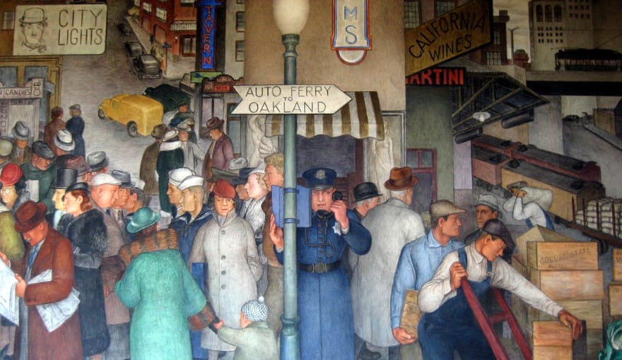
“WPA Mural ‘City Life’ in Coit Tower” via Flickr