A couple of weeks ago, I booted up a new downloadable RPG. It had elves.
Like many RPGs, the rules are first and foremost and the tutorial began to explain to me the many necessary processes and skills I would need to traverse the world. One by one, elements began to appear on screen — a halo around my character to indicate my range, a hit meter, a mana bar, a skill tree. One by one these pieces blossomed on screen and the lush greenery that had once surrounded my hero was now obfuscated by tangle of seven different types of information. It was dreadful and confusing.
What happened?
Dino Ignacio has a very simple explanation. “The problem is that most games design thinking they’ll have dropdown menus,” he says. It reflects a fundamental disconnect between what game designers want and what the players need. Designers suddenly realize the freedom of motion on the PC isn’t available on game consoles. “A lot of UI is designed with the mouse in mind. It never translates.”
These types of decisions unwittingly doom many games before they’ve even started. It’s Ignacio’s job to make sure that doesn’t happen. As the user interface design lead for the survival horror game Dead Space 3, he’s tasked with designing all the elements that a player might need to navigate and manipulate this virtual world. His fingerprints are all over what you see on screen. To be more specific, it’s what you don’t see.

For many first time players of the Dead Space franchise, it was a breath of fresh air. All the traditional “HUD” or heads-up display elements that normally obstructed the player’s view were gone. The health bar had been replaced with a glowing section of protagonist Isaac’s suit that communicated his and your well-being with color as well as height. Ammo appeared on the weapons themselves. Gone were complex maps to guide you. A navigation system was laid out on the floor to lead the way. All of those barriers that made games seem horribly complex had been removed and stripped away to their bare essentials. What you see is what you get, indeed.
Ignacio serves a type of editor, winnowing away what you see down to its bare essentials. He says everything needs to be “one click away” and rather than giving players more information, he tries to find ways to give them less. But what is communicated takes on a dramatic importance. “We only present the player with what needs at the time. It needs to be clean and it needs to be easy to get to.”

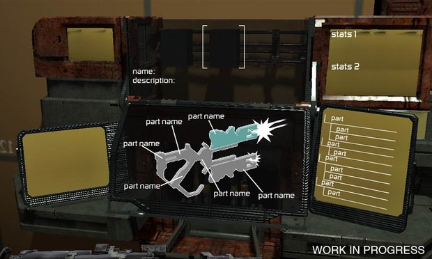
Early design for Isaac’s workbench
This is a dominant philosophy in the world of apps and the web, but is less common in games. Think about the number of steps that it takes to share a photo on Instagram. It’s those four devilishly simple tasks that lead to a $1 billion acquisition of the company from Facebook. Ignacio hopes to make navigating the world of Dead Space that easy. One of his design heros, Dieter Rams, the genius at Braun who later influenced Apple’s Jony Ive, once said that good design was “Less, but better.” Ignacio echoes that refrain to me over the phone as a bit of mantra: “Simplify and hide.”
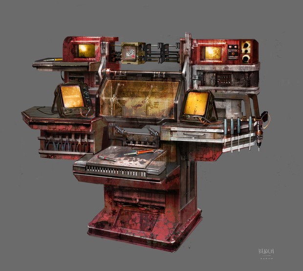
Perhaps nowhere can Ignacio’s hand be seen more clearly than in the newly-designed workbench. Lead character Isaac Clarke is an engineer and in Dead Space 3, he can now craft his own weapons, piece-by-piece. This customization is a boon for players, but presents a challenge for Ignacio. With hundreds of thousands of options available, how do you make the process easy and not like the obtuseness of Photoshop?
Lots and lots of playtesting. Most significantly, they used the analog stick to make a “radio” buttons to steamline the player’s process and limit their options.
Ignacio studied computer art at the Academy of Art University in San Francisco, one of the largest art and design schools in the country. He developed a strong interest in motion graphics and found himself at Gamespot before fielding a call at Electronic Arts for a new horror franchise. The series was Dead Space and fortunately for Ignacio, “They weren’t looking for a typical UI guy.”
His newness to the field was a blessing. Normally, UI is something that’s layered on top of the screen, like drawing on a whiteboard. It’s a lens that’s applied after the fact. Ignacio believed that UI should be something inside of the world, something tangible. The information is actually generated as an object inside the world that occupies real space. It’s as touchable as Isaac’s suit.
Moreover, Dead Space is a third-person game. In first person games like Halo and BioShock, HUD elements are explained away narratively. You’re in some sort of suit and the information is displayed on its mask. But Isaac is always in the frame, for better or worse. “Since it’s a third person game, the usable data should be behind Isaac,” Ignacio says.

Unreleased concept for workbench design
What does that actually mean for the player? In a horror game, the more that you can keep players invested in the world and the less you can remind them where they are, the easier they are to scare. Bad UI is like a cellphone that goes off during a scary movie. Suddenly, you remember where you are and the moment is lost.
But having UI elements as “physical” objects takes on an even deeper, metaphorical prescence in Dead Space. In a film, if you’re watching a character playing music on the radio, the music will continue to play, even if you aren’t shown the radio any more. “The music belongs to the character and to the movie as a soundtrack, but to the audience now,” he says. “That’s what s called ‘diegetic audio.’ We make our UI so it belongs to the players.” If Ignacio does his job well, the player won’t even notice.
Therein lies the problem. Most players won’t ever realize Ignacio’s contributions, because literacy for UI is still very low. It’s not a problem limited to gamers of course. Bill Moggridge, designer of the world’s first laptop and director of the Cooper-Hewitt National Design Museum lamented the lack of appreciation for design in 2006:
So few people seem to realize that everything’s designed. And until we get some good people telling the story, that’s probably going to continue to be the case. So I’d love it if there was a consciousness in the public mind that mathematics and reading and writing is not enough — you also need to learn how to do design. Because everything is designed, and the way our world exists around us depends on how well it’s designed.
There are certainly signs of progress and Moggridge’s complaint becomes less true every year. For the first time, design is on its way toward widespread acceptance. Hence, the importance of Ignacio’s work on a huge commercial title cannot be understated. Games are well on their way.
