The Psygnosis generator will remind you how great game box art can be
Videogame box art is in a pretty awful state. This isn’t really news to anyone; it’s been like that for a while. In fact, since the days of the second generation of the 3D era, box art has been on a steady decline.
That’s a long time, so long that you might have even forgotten what good box art looks like. Perhaps you don’t mind DOOM’s painfully generic marine, or Call of Duty’s yearly scraping of the bottom of the barrel for new poses men can hold guns in. It’s not that every bit of modern box art is bad per se, it’s that box art itself seems to have lost its sense of identity, becoming just a clichéd piece of imagery to be assigned to a game—a way of publishers convincing themselves that they are hitting a fictional target market of regular salt-of-the-earth “gamers.”
luxuriously artworked packaging by sci-fi surrealists
The situation was perhaps epitomized by Ken Levine in Wired outlining the race to the bottom that led to BioShock Infinite’s (2013) godawful Tea-Party lite cover, with its notable absence of both the games’ extravagant setting and its main female character. He explained that “we went and did a tour … around to a bunch of, like, frat houses and places like that” apparently to meet “People who were gamers. Not people who read IGN.” And finding that those people didn’t know about BioShock, Levine decided they were his target. “For some people, [games are] like salad dressing,” apparently, and according to Levine “that’s who the box art is for.”
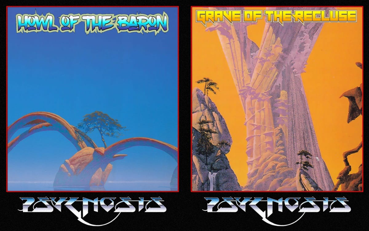
But wash that awful taste from your mouth, because it doesn’t have to be like this. Click instead on this link to be transported to a lost world where box art was a matter of style, expression, and looking so fucking cool it hurt. Alright, yes, it is just a webpage programmed to generate images from some chopped up bits of sci-fi art with some psychedelic fonts and suggestive nouns plastered over the top. But let’s have some context here.
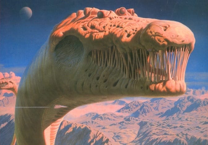
Psygnosis was born out of the still-warm corpse of Liverpool’s Imagine Software in 1985. Designed from the very start to be a publisher/developer hybrid with a relentless pursuit of style, they hired legendary record cover artist Roger Dean to design their logo, filled their offices with artists, and took weird and ambitious projects under their wing. Their approach took projects from single programmers or small groups, paired them with their own internal art team, and put out the results in luxuriously artworked packaging by sci-fi surrealists like John Harris and Melvyn Grant.
just sit and experience the imagery
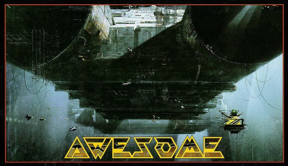
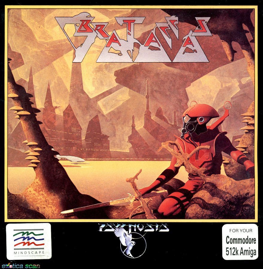
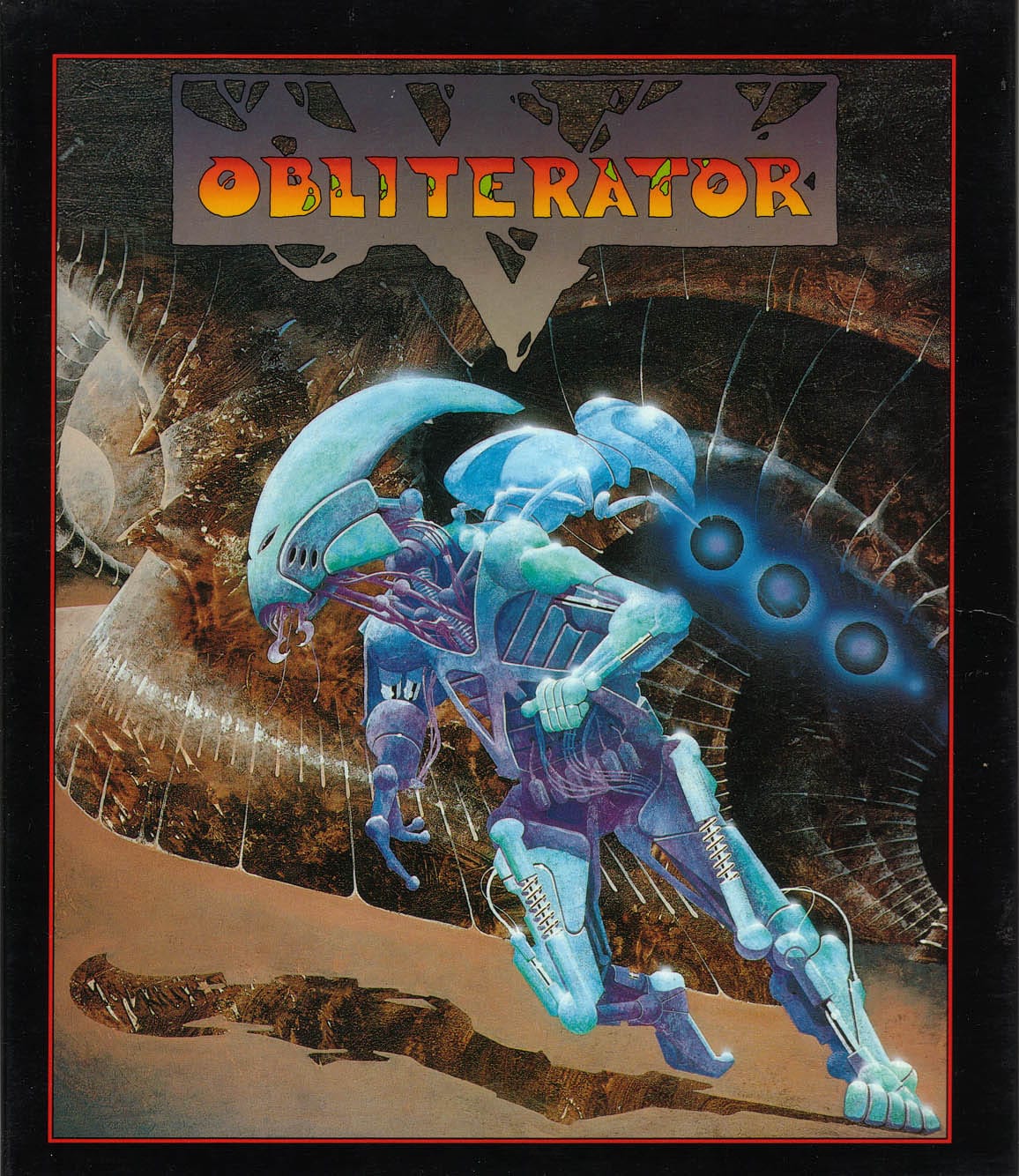
Just look at the cover for Brattacus (1986) or Terrorpods (1987) or Ballistix (1989) or Obliterator (1988) or Awesome (1990). These were not designed to have the widest possible appeal, but instead to create images that are memorable, exciting and feel like the game plays. After all, Psygnosis’ games, though among the most visually impressive for their time, could never come close to the covers that held them on a purely visual level. They could, however, in their esoteric and ornate gameplay, weird worlds, and strong sense of style, capture the same feel.
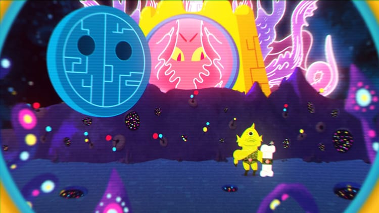
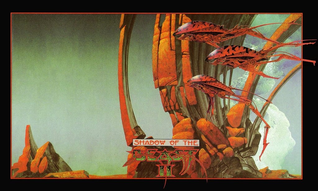
It’s something you can detect a trace of when you hit generate again and again on the cover art machine, but it was something deeper too. Because over time, the sensibility of Psygnosis cover art started to infect their games. Extensive intro sequences of single frame art and evocative music became a calling card, forcing players to just sit and experience the imagery. Shadow of the Beast 2 (1990)—a strong contender for the best of Psygnosis cover art—even featured this absurdly awesome death screen (audio on, please), which resembles 40 seconds of mid-game cover art, put there just because they could.
Psygnosis’ covers and the attitude that came with them exploded the limits of what people thought games could be or do in that era. And while randomly recreating them from atomized Roger Dean artworks might not be the ideal memorial, it’s a worthwhile reminder that we should be expecting more. Because what Ken Levine meant with BioShock Infinite’s box art, in his own patronizing way, was: this is what I think stupid people like. He decided to play to what people know, not their imaginations, and his image of “salad dressing” gamers is insulting to everyone involved.
So put on the Obliterator theme and get generating, because you may well come across the best cover art you’ll see all year.
Generate your own Psygnosis game covers right here courtesy of Rob Beschizza.