“The history of letters is, you see, the history of our entire civilization.”
It’s a bold claim from a man who knows what bold looks like. Theo Le Du Fuentes is the creator and lead designer of Type:Rider, a new game from Cosmografik about the evolution of lettering over time. As such, it’s also about, well, everything.

You start in a cave. Here is where the first letters were born. Here, too, is where the ugly chaos of mankind slowly refined itself into something less brutal. With language came the first seeds of civilized thought. Type:Rider moves us from these origins into something more permanent. And so the second level and its Gothic font introduces the printed page, and with it the notion of ideas shared not over campfires but proliferating through town squares, passed between friends, torn up by rivals. Language has gone from ephemeral thought to physical artifact.
Curiously, it took language devolving back into intangibility for its ungrateful users to give a damn. With the steady ascent of digital communication and screens as our default lens into the world and its populace, people suddenly care what their thoughts look like. A thousand years ago, specially trained monks copied books for others to read. Now, blog software like WordPress has thousands of designs focused on font and type layout for any Joe or Jane Schmoe to peck out their thoughts. Le Du Fuentes and his team are but the latest to grasp onto our sudden love affair with not just words but WORDS: How they look and what that says about us.

The documentary Helvetica is a film about a font. That sentence doesn’t exist, can’t exist, a generation ago. Entire communities have risen up against certain typefaces as if its lower-case “g” slapped their unborn child. (See: the sad story of Comic Sans.) But what Le Du Fuentes sees in a font isn’t just personality or aesthetic taste. He sees perseverance. He sees work.
When I ask him why he chose typography as the foundation for his game, he quotes French art historian Maximilien Vox: ‘Typography is simple, as simple as playing the violin.’
“You can spend years working on a font,” Le Du Fuentes says via email, “weeks adjusting the inter-lettering, entire nights drawing the curves of the perfect ‘A’ and hours adjusting the interline of your next poster. To love typography means to love refin[ing] and work[ing] for hours on details which will be invisible to most people.”
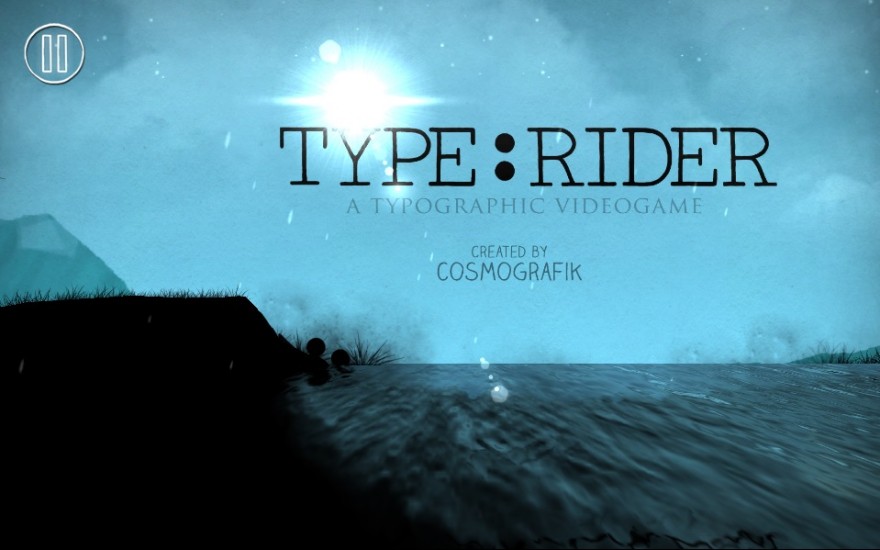
Type:Rider is an attempt to push that craftsmanship to the fore. At its root, the game is a simple platformer, inspired by recent offerings like Ubisoft’s Rayman Origins and Retro Studio’s Donkey Kong Country Returns. Instead of controlling a character, you movel what appear to be two spheres along a sloping playfield, until you look closer: These two circles are a single colon, and the undulating ground beneath you is made up of letters. The silhouette visuals and ball-rolling technique will remind you of 2011’s brilliant NightSky, but Le Du Fuentes tells me his initial prototype came together in 2008, only now being fully realized as Type:Rider.
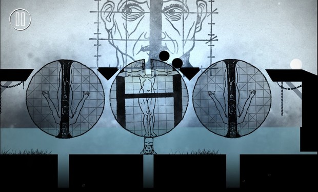
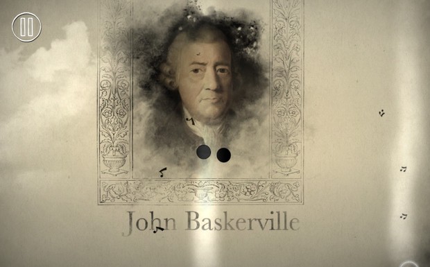
As you roll and jump through increasingly complex stages, you’re told the story of the very letters you tumble across. In the Gothic level, the ink of those transcribing monks becomes a gooey residue impeding your progress; the introduction of the Letter Press creates a massive vice, descending to crush your vulnerable little punctuation. Roll over and through each trap and find yourself within the crowning achievement of that era, the Gutenberg Bible. The effect is striking; you want to move forward if only to witness each new font and the forgotten artwork comprising these novel swoops. Subsequent levels include Garamond, Futura, Times, and Pixel among others.
Choosing a typeface is a detached interaction; playing Type:Rider allows the chance to engage with these shaped words at a granular level. The choice to comprise each level with letters and words feels like some not-so-subtle metaphor for creating language itself. There, words form a foundation for thought. Here, they are the literal foundation on which we roll, bouncing over and around those same letters we first learn as a child and employ, with grace or anger or envy, as adults.
Today, though digitized fonts and powerful editors, we’re able to shape these letters more easily than ever. Yet those same shortcuts allow many to fall in line with pre-made designs, the same for you as for the other million typers who opt for default settings. “People who fall in love with typography are usually maniacs,” Le Du Fuentes writes, a blunt self-assessment he’s proud to admit. “But it is an extremely powerful and creative tool for those who know how to use it.”

Consider Type:Rider the history lesson you never knew you wanted. You can find it on iOS or Android devices, but also can play through their Facebook page. Better yet, try it right now, for free, on their website. Those in Cosmographik’s native France can go to Paris Games Week during the last weekend of October and play a live interactive installation of the game, one that will travel to other conventions in Amsterdam and Montreal.
Just as we shape ideas into pictures with curves, circles and tails, so does our language shape how and what we do with it. Le Du Fuentes recognizes the form’s influence on his own work. “If the game had been made in China, maybe we would have played Type:Rider from the top to the bottom on Chinese characters. If it had been done in Egypt, perhaps we would play it from the right to the left. The country and the culture of a game inevitably influences its gameplay and its story.”
What that story says is up to us. Type:Rider is a reminder of just how beautiful stories can be, regardless of what they actually say.