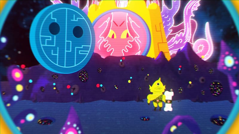
For a game that’s about the alphabet, Metamorphabet’s trailer was hard to understand. How could it be a game for all ages? Is this a game about showing off cool animations, or is it about learning to experiment with words? And most of all, why do the words “antlers,” “arch,” and “amble” all seem to perfectly fit the letter A?
Patrick Smith, director of Metamorphabet and founder of Vector Park, wants us to ask all of these questions. Smith is behind a number of flash and iOS games that capitalize on a mixture of the grotesque and the adorable. Fans of Monsters Inc., look no further. Some are surreal puzzle games, like Windosill, and others play around with elementary physics, in games like Acrobots and Levers.

Metamorphabet is different. “I’ve become quite aware that a large part of my audience on iOS is children,” Smith said. “I don’t have to change a lot to make child-appropriate games. There’s a discoverability aspect in my games. It makes a good fit for kids.” But he was quick to clarify: “This is design for everyone.” Metamorphabet may be a game about the alphabet, and therefore child-friendly, but the art direction alone puts it in a class beyond “educational game.”
Smith saw the alphabet as a conceptual launching pad for his newest game. The Latin alphabet is something we’re all familiar with. Without it, there would be no street signs, no Walmart, and no articles about videogames. To make a creative project out of something that’s so everyday fascinated Smith.
The letter A, for example, dominates the trailer in Metamorphabet. But what can the letter A “do”? Could its legs become actual legs? And that space in the middle, couldn’t that be a head? “You can treat a letter a million different ways. At one time, it’s a figure, a sculpture, a kind of architecture, and a symbol,” he said.
“Type is the most omnipresent of everyday design.”
And the symbolic power of letters is pretty hard to deny. Do we even need a reminder of the power of a good font? Choose Comic Sans on your resumé, and you’re a joke. Edwardian Script, and you’re too pretentious. Helvetica, and you’re a square. This has little to do with the meaning of the words—it’s image, presentation.
Stephen Coles from the typeface review Typographica told me that “type is the most omnipresent of everyday design. Everyone interacts with it, but most people don’t realize it is designed.” Metamorphabet might just be experimenting with shape through the contours of letters. But what it’s making us remember—that letters are no more than constructed lines that are easily altered and changed—makes for a promising game.


