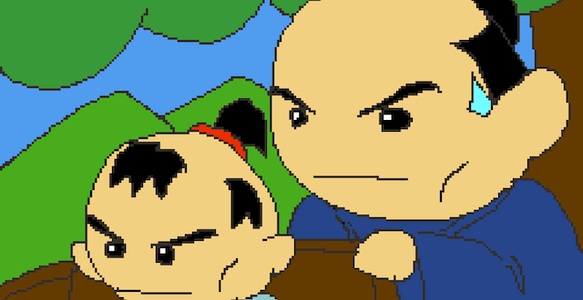
Super Mario World 2: Yoshi’s Island is a videogame for the Super Nintendo created in 1995, and arguably the best two-dimensional platforming game ever made. But the game couldn’t have existed without something invented 90 years earlier—not some predecessor to the microchip, or a particularly advanced boardgame, but Fauvism, a visual art movement that became famed in the early 20th century for its passionate embrace of bright colors and compressed space.
Fauvism, which literally translates to “wild beast,” is so named for the term used by shocked French critic Louis Vauxcelles to describe his immediate reaction to the works of such painters as Henri Matisse and Andre Derain featured in the 1905 Autumn Salon, a rebellious exhibition held in response to the Parisian Academy Salon’s own conservatism. In fact, the artists’ color choices in their painting of landscapes and figures remain shocking; deep, cool blues set against incandescent reds and oranges light up Derain’s French seascapes, while Matisse’s portrait of his wife with a single lime green stripe down her nose still manages to upset viewers.
“Wild beast” could just as accurately describe Yoshi’s Island’s careening sense of color, with level backgrounds that range from pastel-tinged mountaintops to green-jeweled forests and dank blue caves. During the game’s introductory cut scene where Baby Luigi first goes missing, the rainbow group of Yoshis congregate in a surreally-colored forest bower, with pale pink and orange bushes, parti-colored vine tendrils of blue, green and purple, and trees set with orange flowers. In the early stages of the game, Yoshi bounces through rolling hills, afternoon sunlight turning them a bright, solid yellow. The game looks beautiful, but looking with an eye to art history, Yoshi’s Island’s aesthetics are actually very avant-garde.
As a descendant of Impressionism, Fauvism took the Impressionists’ interest in abstraction and color theory to the next level, filling canvases with eye-popping juxtapositions of discordant colors, set out in flat, monochromatic swaths that defy viewers to turn them into something legible. Is that the ocean, the sky, or a plain of grass turned blue? It’s up to you. Kind of like squeezing your eyes shut on a sunny day in deep summer, opening them, then quickly shutting them again, Fauvist pictures burn into your retinas. Derain’s The Turning Road at L’Estaque (1906) is a dusky mix of reds and oranges, but the shadows of the trees set into the road cast deep-blue shadows, tinged with green. It’s the light of an intense sunrise or sunset.
The favored technique to create this burn was to set two complementary colors against each other. The classic combination is red-orange on blue (clearly apparent in The Turning Road referenced above), but any opposites on the color wheel—pink and green, yellow and purple—all pack the same punch. Derain’s same technique is clear in Yoshi’s Island: check out Level 1-1 and see the yellow hillsides dotted with cool-blue rock outcroppings, jutting out into a pale-blue sky and clouds tinged subtly with orange and pink. The trees of 6-1 are bright orange-red, but their shadows, silhouetted in the sunset, are deep blue. In 3-2, yellow leaves stick out against a dusky purple background. The palette is strikingly similar to that of The Turning Road.
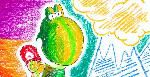
It’s not just the game’s colors that recall Fauvism. Yoshi’s Island’s aesthetic is painterly, displaying individual brushstrokes. Neither the paintings nor the game display a need for gloss or perfection; they’re messy, embracing a loose sense of serendipity, colored collisions. Shigeru Miyamoto, the iconic Nintendo designer who has noted the influence from Impressionism on his games, pushed Yoshi’s Island to look hand-drawn, emphasizing the scratchy crayon strokes that make up the game’s backgrounds and the rough outlines around its sprites.
Gamers don’t need to just take my word for it that Yoshi’s Island was influenced by Fauvism and its contemporaries. Just ask Miyamoto: in the upper reaches of Level 6-7 there is an outright nod to Vincent Van Gogh with a sky full of hazy moons and stars, shown in brushy yellow strokes against a deep blue. Starry Night, anyone? Though acknowledged as a Post-Impressionist artist, Van Gogh’s solid colors, thick paint, and dramatic juxtapositions are clear reference points for the Fauves. Doubtless Derain and Matisse would have appreciated its inclusion in a game so driven by their own aesthetics.
Though Yoshi’s Island is probably the best example, plenty of other games display a Fauvist tilt. The bright, acid colors of Super Mario Bros. 3—particularly its Super Mario All-Stars port on Super Nintendo—and its predilection for textured, complex backgrounds echo the same aesthetic choices, as do the palette of Super Mario Sunshine for GameCube and the flattened blocks of color and stylized abstraction of The Legend of Zelda: Wind Waker. There are even subtler hints in games like Final Fantasy Origins. More recently, thatgamecompany has brought Impressionism to the fore with Flower, andFauvism with its upcoming Journey, setting a red slash of cloth in the midst of the desert’s deep orange.
Where Yoshi’s Island sets itself apart isn’t only in its commitment to the core tenets of Fauvism; it is also in the originality of the game itself. Yoshi’s Island innovated platforming with an expanded visual vocabulary, but also with an interactive vocabulary of new elements. The game allows players to go up, down and across, burrow through the levels as a mole-digger, circle back around to find those last few Yoshi coins, climb chair lifts, and push snowballs. So it’s worth savoring—both for the visual punch and the ride.
Illustration by Daniel Purvis

